Hey there folks! I was at the Sherwin-Williams Colormix Forecast last Wednesday night and was inspired by the extensive thought and consideration Sherwin-Williams put into creating their 2018 colour palettes. As a result, I thought I'd share some of the key colour and interior design trends that you can expect to emerge within the upcoming days, weeks and months of 2018. And, if you'd like our free Perfect Paint Colour Checklist and Coordinating Paint Colours Guide, Join our Design Tribe.
WE ARE ONE
Sherwin-Williams has created three distinct colour palettes with one idea in mind – the idea that we are all one, we’re all connected and we’re all unified as people. The colour palettes are appropriately named Unity, Connectivity and Sincerity.
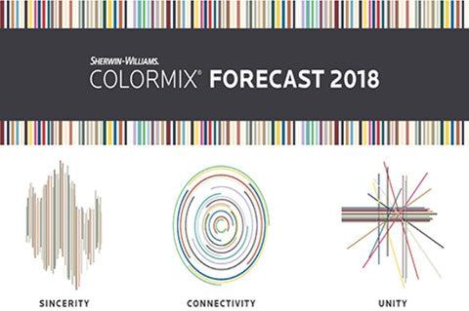
Photo Credit: Sherwin-Williams
“Everycolour is a collision of influences - every palate a fresh chance at community.” – Sherwin-Williams
Here’s a quick breakdown of the three colour palettes and how they relate to 2018 interior design trends.
UNITY
The Unity colour palette was born from the notion that we are boundary-less. We are one. Nationalism and globalism are influx. Generation Y and Z are both seeking more serenity and adventure. Therefore, they value inclusiveness, travel more and bring cultural influences home with them. Consequently, the colours prevalent within different ethnicities and cultures are influencing 2018 colour trends and thus, paint colour palettes. Transculturalism, community, artisanal crafts and indigenous patterns are strong influencers within the Unity colour palette.
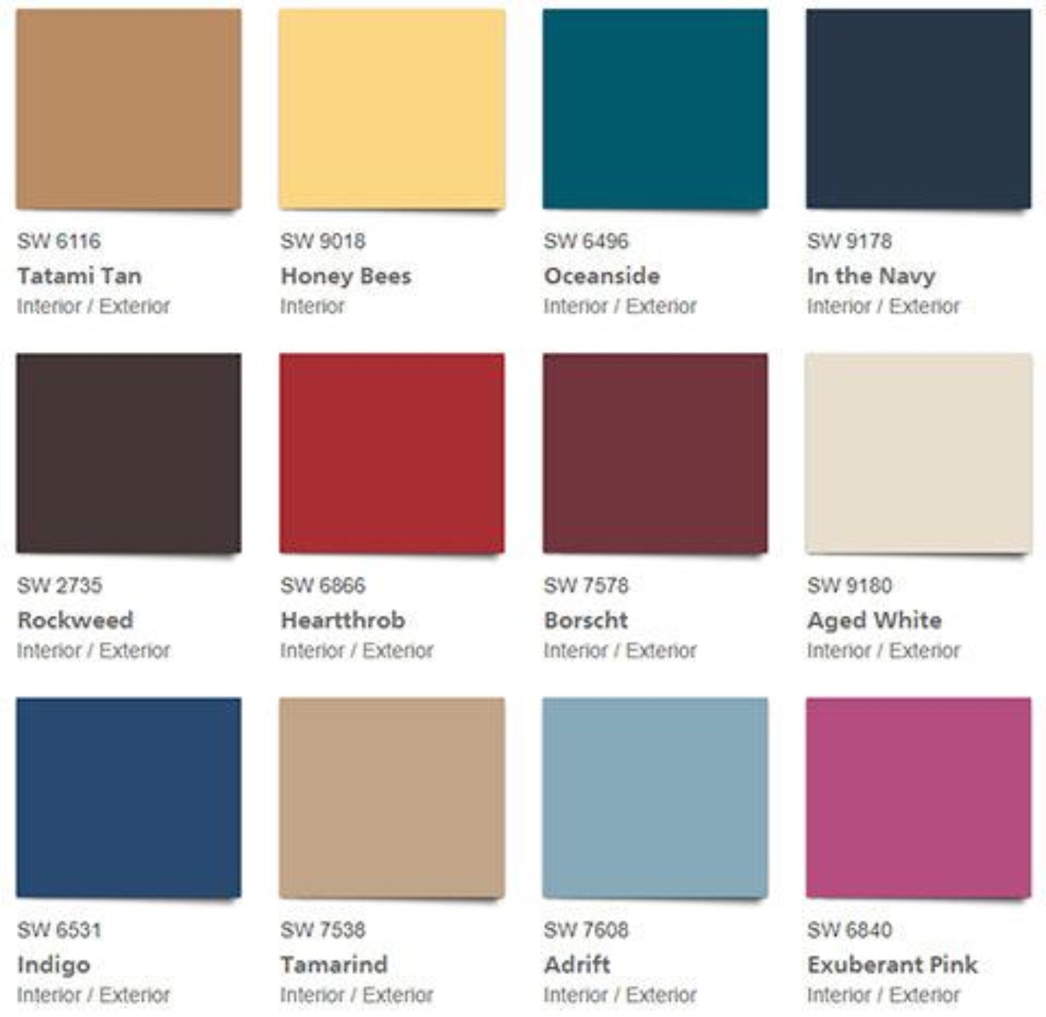
Photo Credit: Unity by Sherwin-Williams
My personal favourite within the Unity colour palette is "In the Navy." as seen on the left in the image below. I love the rich, boldness of the colour and how it contrasts well with so many other colours, but still stays within my own personal comfort zone.
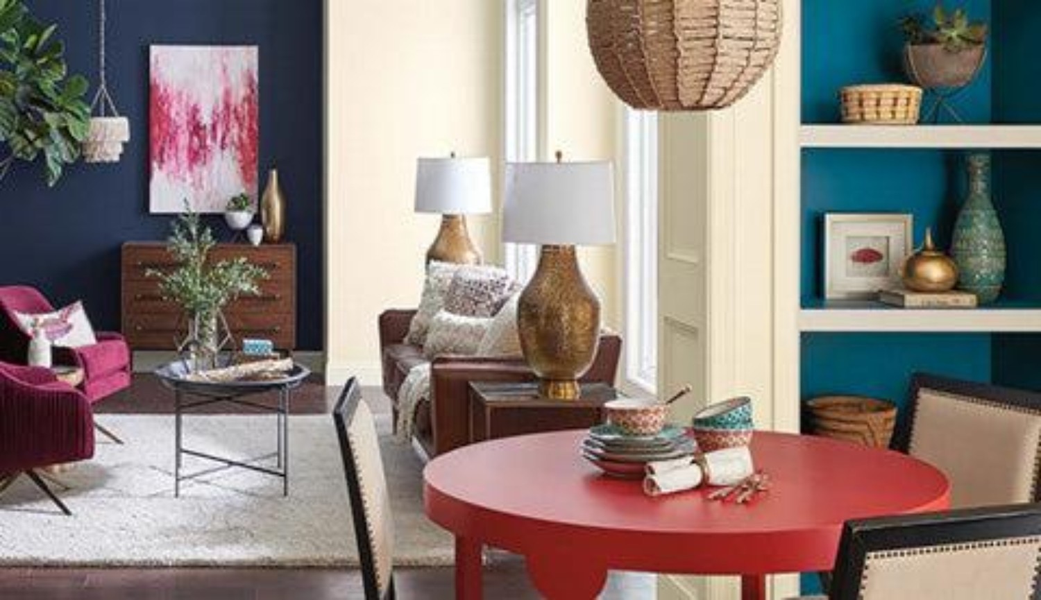
Photo Credit: Sherwin-Williams
With respect to interior design trends, the idea of unity is demonstrated through developing more community gardens and green space for people to enjoy. Architects and Interior Designers are embracing community building as a philosophy for their designs. Innovators are designing products like GrandCare to support all living generations backing the idea of living together/oneness or at least the experience of closeness/living together. Women are becoming more empowered as we lean more and more toward gender equality in every facet of living. These trends are personified in colours and names within Sherwin-Williams’ Unity colour palette.
With respect to interior design trends, expect to see more tassels, knots, fringe, macrame, chunky weaves, recycled yarns, wood grain, cerusing, folk patterns, patina and a lot more rustic touches. Homes will be designed to be more livable as well. Therefore, you'll see a lot more reclaimed and recycled wood in flooring and furnishings.

Photo Credit: Antiqued, Hand-Distressed Oak (Breezewood Floors)
Photo Credit: African Mud Cloth Pillow (Acre 75)
Photo Credit: "Eva" Wall Hanging (Teddy and Wool)
CONNECTIVITY
Sherwin-Williams’ Connectivity colour palette pays homage to the tech world. It focuses on high-tech, data-driven colours. The idea is that even though we’re all connected, we're all “moving to the beat of our own algorithm” (Sherwin-Williams). Techies are the new hippies and they’re creating the future. They want revolution - not evolution. People want more balance and they're using data to help them. There's an app for everything from the fitbit to the melomind. There’s a focus on micro-living and we're using compact, multi-functional furniture to achieve it. These new generations are more mindful about eating for a healthy lifestyle, rather than just for weight loss. Food is respected and is beautiful.
California pop and youth culture, techies, virtual reality, productivity and environmentalism influence the Connectivity colour palette.
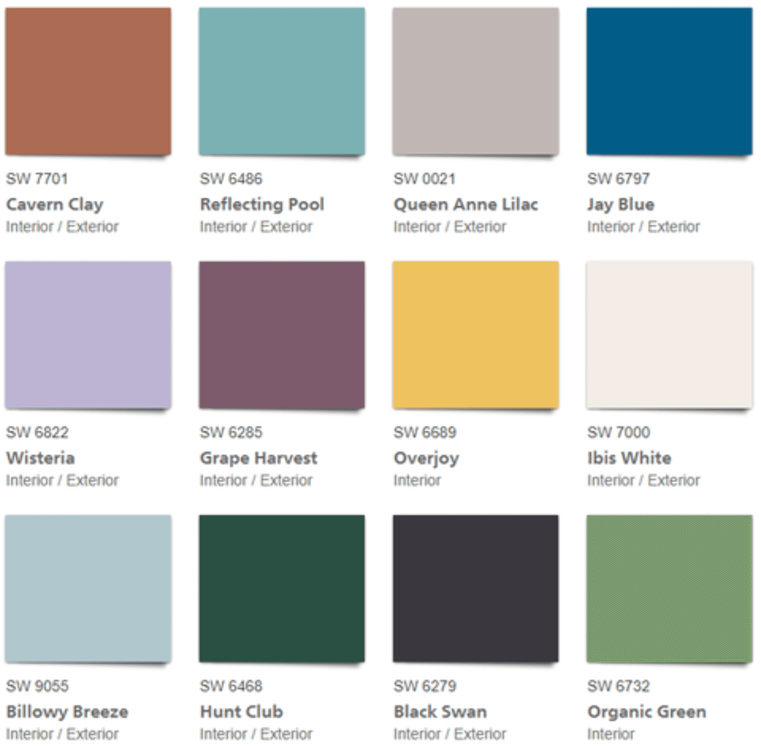
Photo Credit: Connectivity by Sherwin-Williams
Queen Anne Lilac and Ibis White get my votes within the Connectivity colour palette. The subtle, softness of Queen Anne Lilac is so comforting, while Ibis White provides a neutral backdrop for any other colour to standout.
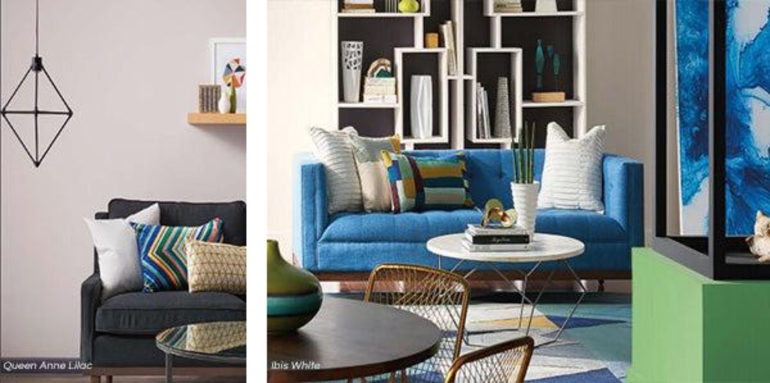
Photo Credit: Queen Anne Lilac (Sherwin-Williams)
Photo Credit: Ibis White (Sherwin-Williams)
In terms of interior design trends, there's a strong influence of geometric play with little to no rules. Mirrored metallics, vibrant colours and 1970s lacquer have a retro vibe, but futuristic feel. Bold stripes, gridlines and triangles are also popular.
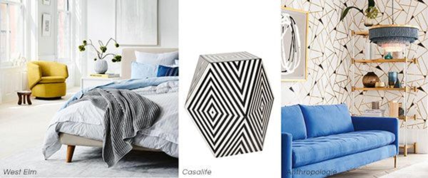
Photo Credit: Crescent Swivel Chair (West Elm)
Photo Credit: Nil Accent Table (Casalife)
Photo Credit: Geo Mosaic Wallpaper (Anthropologie)
SINCERITY
The Sincerity colour palette is based on our increasing desire for realness, silence and minimalism. Flaws are treasured - #nofilter. People are meditating more and trying to use technology less. We’re also de-cluttering. Less is more as we think more about preserving our environment, using sustainable furnishings and moving information into the cloud. Minimalism is IN, stuffocation is OUT. We have entered an era of anti-everythingism; focusing more on what is important to each of us. The Sincerity palette is influenced by silence, Instagram, minimalism, normcore and Hygge.
As a result, the Sincerity palette is full of warm tones that create a warm, cozy and comfortable feeling. Even the cooler green and grey colours have warm undertones. Sherwin-Williams describes the Sincerity palette as having hushed tones of sand complex greys and hazy botanicals.
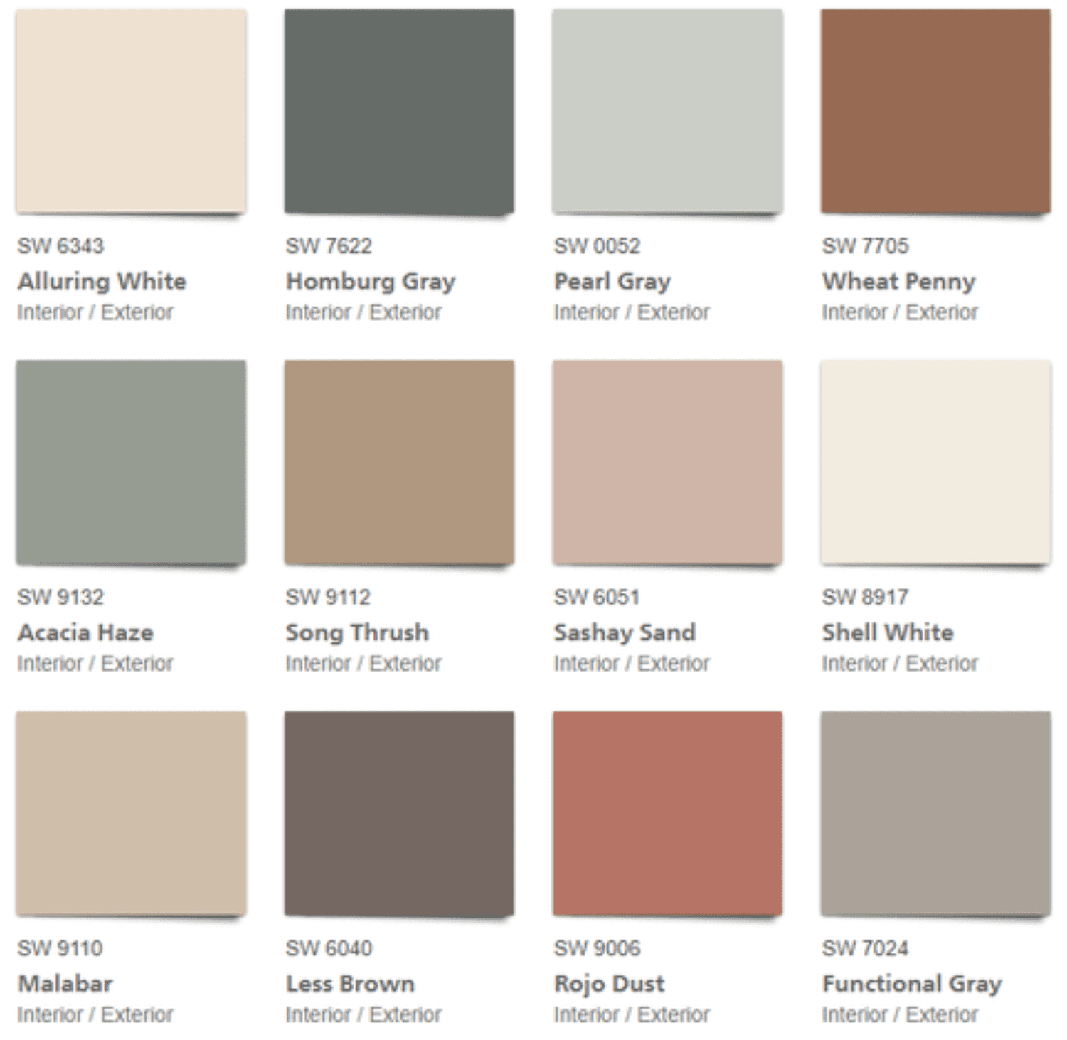
Photo Credit: Sincerity by Sherwin-Williams
Personally, I love all the colours in the Sincerity colour palette. The colours and tones are warm, earthy and inviting. The colours of Sincerity have a relaxed, calming vibe and are still rich in colour. My favourite within this palette is Functional Gray. It's a neutral colour which means it goes with almost anything. What makes it so appealing though, is that it has some depth and therefore can make quite an impact when paired with white or other neutrals.
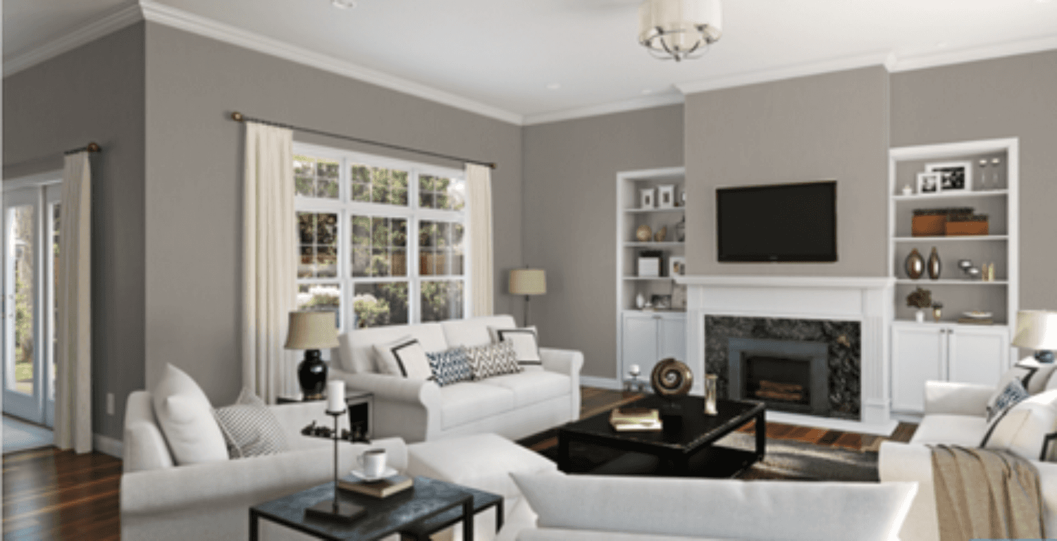
Photo Credit: Functional Gray (Sherwin-Williams)
The 2018 interior design trends related to the Sincerity colour palette are inspired by nature and finding beauty in imperfections. Natural materials such as Nordic woods, marble, agate and stone are popular. You'll also see more smooth surfaces in muted tones of bronze, pewter and platinum, as well as a continued trend for brushed brass. However, Hygge has perhaps the most significant impact. Expect to see plenty of candles, snuggly bedding, natural materials and treasured photos as we continue to crave more comfort.
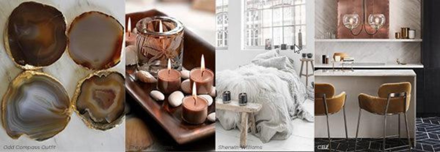
Photo Credit: Natural Agate and Gold Leaf Coasters (Odd Compass Outfit)
Photo Credit: Sherwin-Williams Colormix Forecast Presentation
Photo Credit: Sherwin-Williams Colormix Forecast Presentation
Photo Credit: Essex Marble Server (CB2)
So that's a brief overview of what I learned at 2018 Colormix Forecast by Sherwin-Williams. If you want to know more, contact your local colour expert. And, if you're in need of a painter for your project, my go-to painting service is WOW 1 Day Painting. If you're in the Kitchener-Waterloo area, my contact is Tyrone DeBrouwer. He's friendly, professional and stands by his staff's workmanship.
This is an exciting time for us. There has never been a time when we have been more welcome to share our flaws and be real. If there is a time for authenticity, this is it. I hope that this movement leads to more peace, more kindness, less anxiety, less war. I feel privileged to live during this time and I'm excited for what’s to come.
I hope you found some inspiration for your next interior design project. If you'd like help with your next painting or interior design project, check out our services or feel free to contact me; I'm happy to help you. In the meantime, let me know if you liked this article and would like to see more like it by leaving a comment in the section below. If you did like the article, please help me by sharing it with your friends and family.
Until next time...happy designing!
Let's talk about your project. No pressure, no obligation, just a friendly conversation about your vision and how we can help bring it to life.
