This post includes affiliate links. Please read our disclosure for more information.
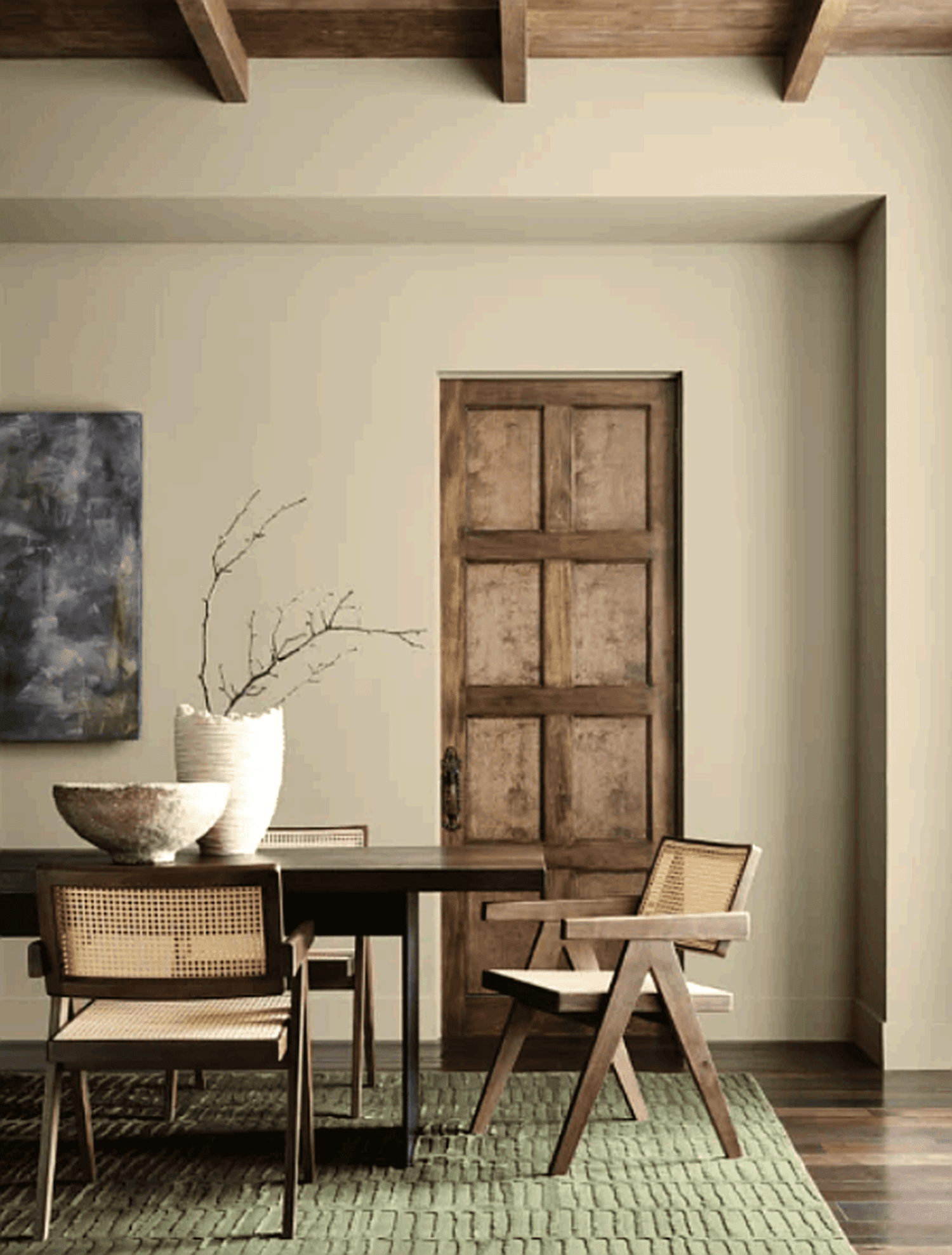
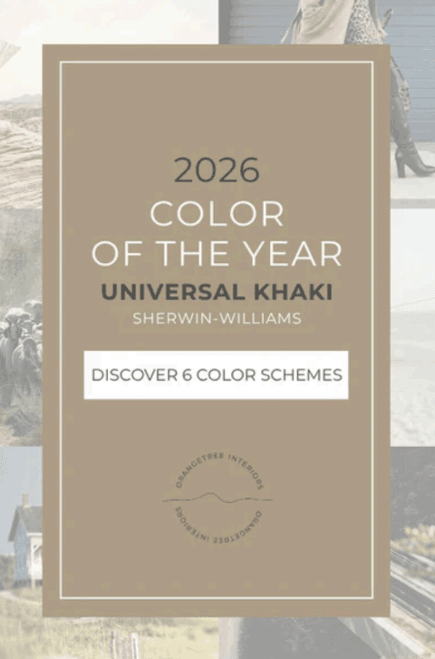
UNIVERSAL KHAKI: THE NEUTRAL THAT NURTURES
Some colors have a quiet power.....the kind that instantly makes a space feel calm, grounded and
effortlessly beautiful. Sherwin-Williams’ Universal Khaki (SW 6150) is one of those shades.
Although it’s a neutral, it’s anything but boring. This warm, earthy color has a slight green
undertones in it that help to create homes that feel natural, balanced and comfortable.
About Universal Khaki
Universal Khaki has an LRV of 40 (more on LRV here), which places it in the mid-tone range in
terms of level of color. It’s perfect for adding warmth and depth without darkening a space too
much. It’s cozy in daylight and even cozier in low light.
As a designer, I personally recommend Universal Khaki for rooms where you want a sense of
calm focus or grounded energy, but you could easily use it on cabinetry as well. Because it’s a
mid-tone neutral, it adds sophistication subtly without overpowering other design elements.
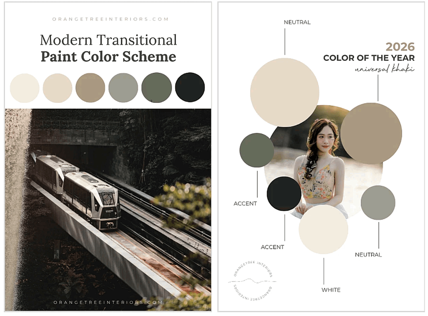
Six Ways to 'FEEL' Universal Khaki
When I create paint color schemes for my clients' homes, I always begin with emotion. One of the first questions I ask clients is how they want to 'feel' in their space. Today I’m using Universal
Khaki as the anchor for six unique color palettes; each designed to evoke a specific feeling
while working beautifully with a variety of styles.
Not sure of your style? Take our NEW! Style Quiz.
Whether your heart leans coastal, modern or farmhouse, each of these paint color schemes will
help bring warmth, calm and comfort into your home with ease.
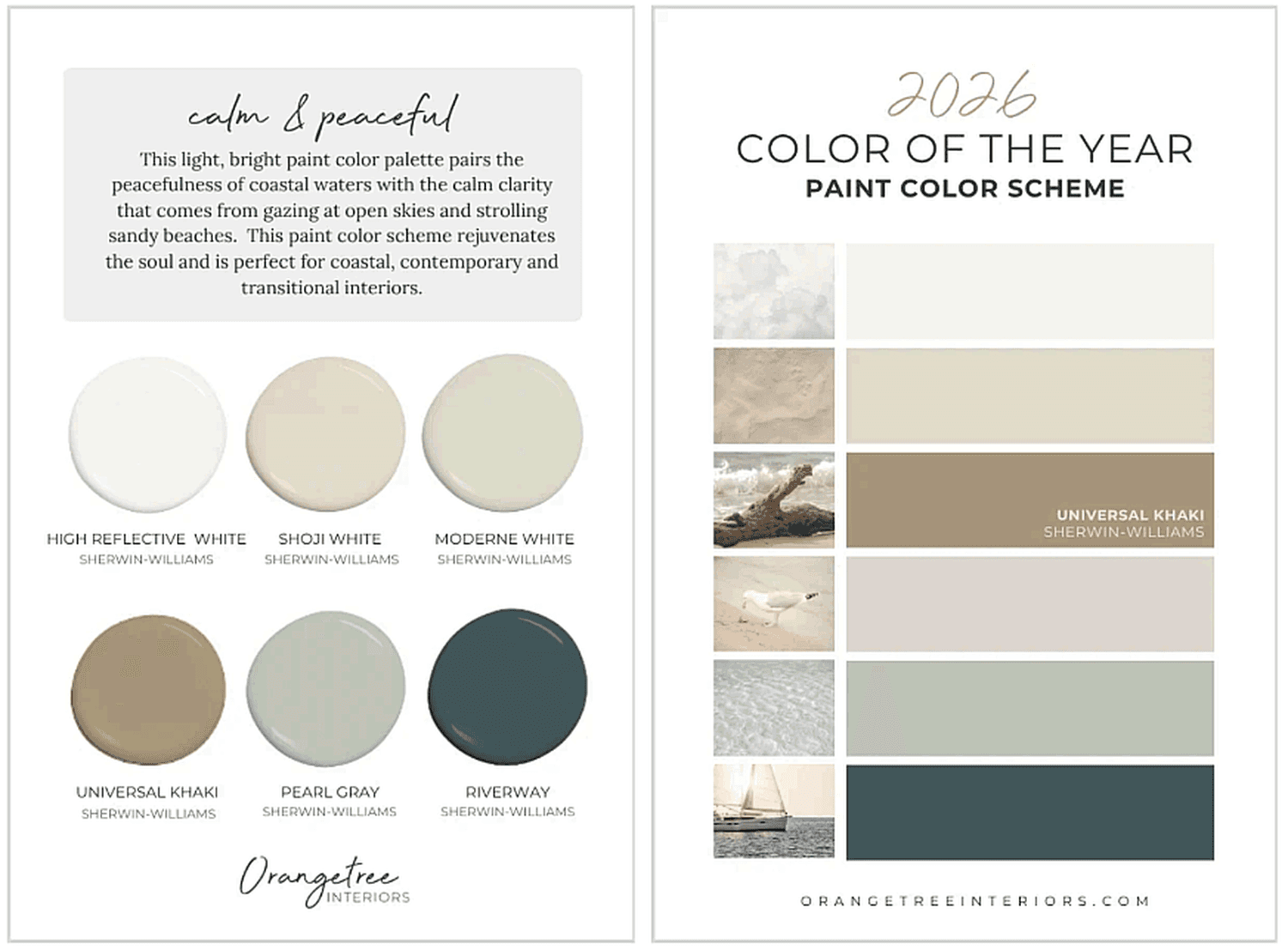
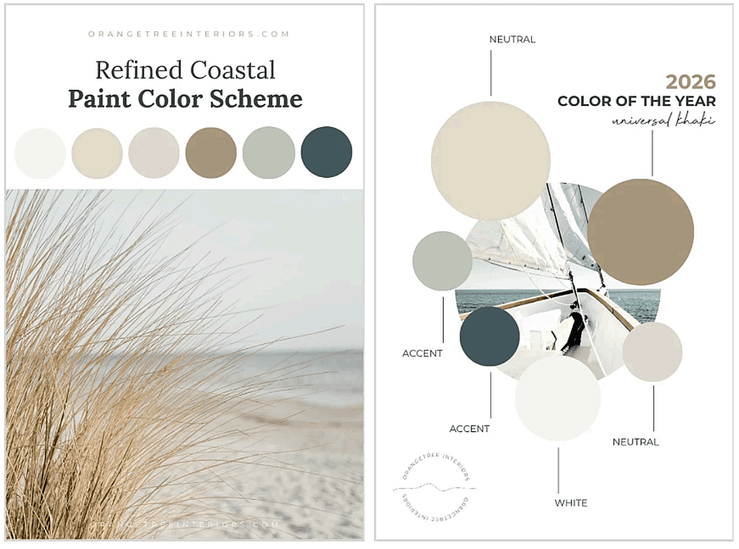
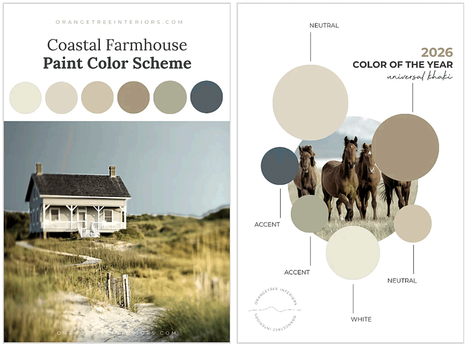
PAINT COLOR SCHEME #1 | Calm & Peaceful
A soft, beach-inspired palette that pairs the colors of warm sandy shores with cool coastal
waters for a space that embodies pure serenity.
Best for: Coastal, Contemporary or Transitional home interiors.
Feels like: Watching waves roll in — calm, refreshing and endlessly soothing.
[Pin for later!]
Get quick-ship, peel & stick samples here:
High Reflective White | Shoji White | Moderne White | Universal Khaki | Pearl Gray | Riverway
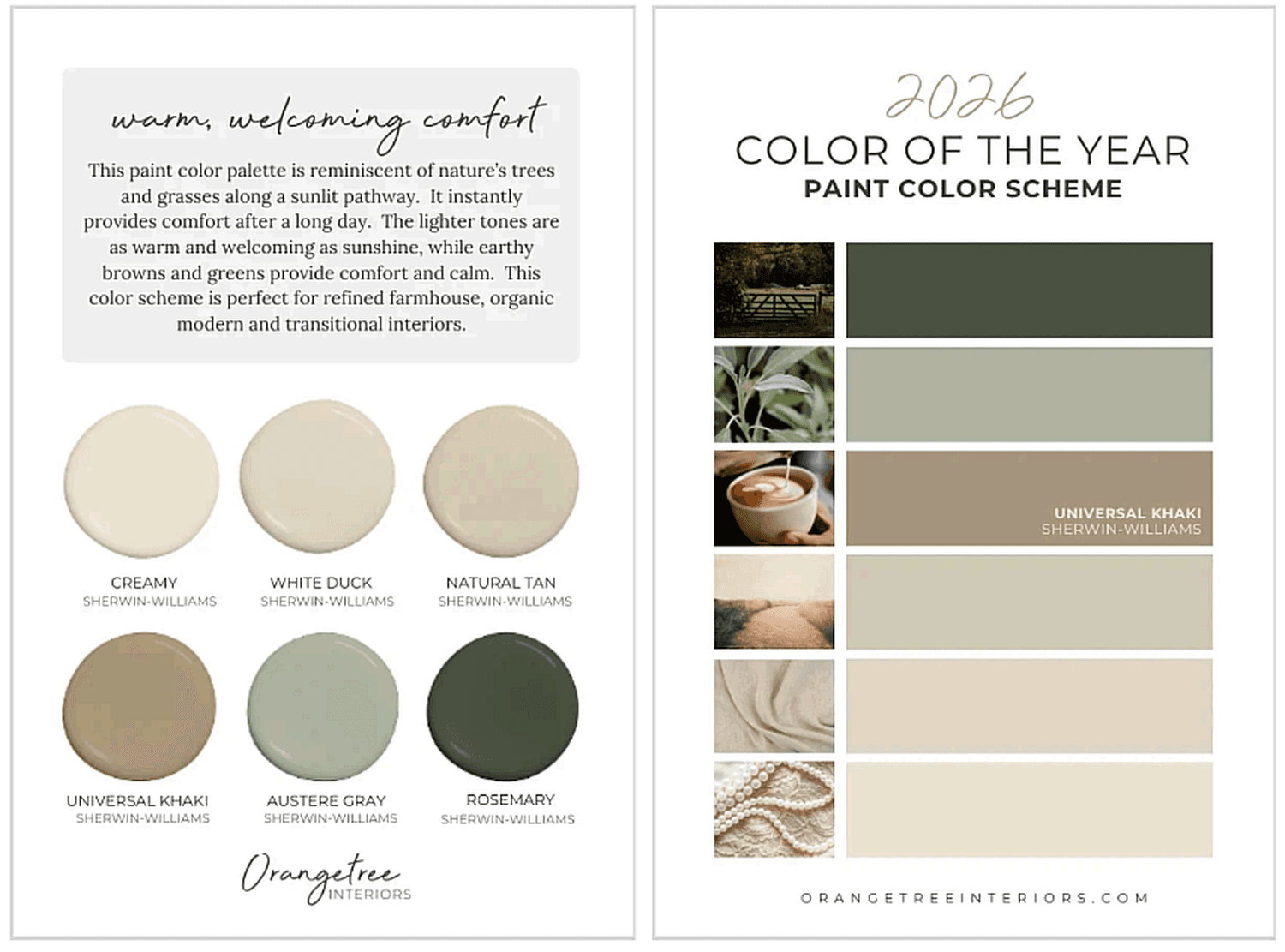
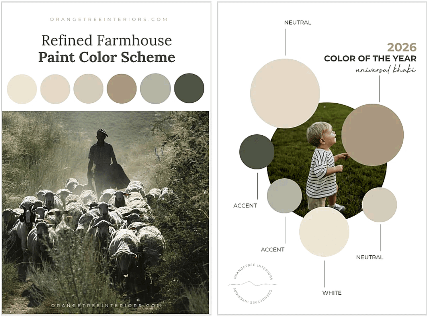
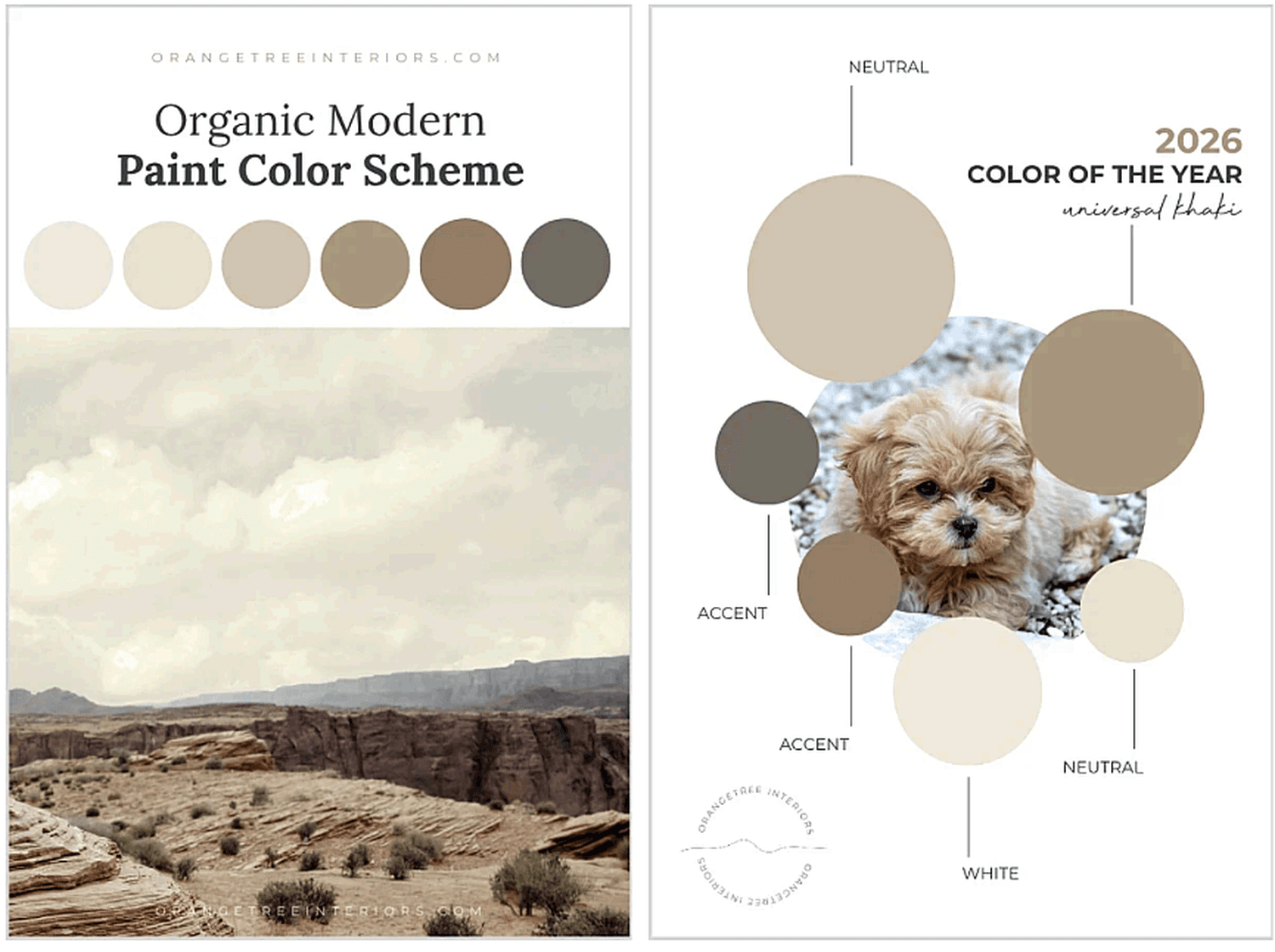
PAINT COLOR SCHEME #2 | Warm, Welcoming Comfort
Reminiscent of sunlit pathways and the beautiful tones of nature, this palette combines warm
neutrals and earthy greens for a space that feels inviting and grounded.
Best for: Refined Farmhouse, Organic Modern or Transitional interiors.
Feels like: coming home after a long day and cuddling up with a warm, cozy blanket.
[Pin for later!]
Get quick-ship, peel & stick samples here:
Creamy | White Duck | Natural Tan | Universal Khaki | Austere Gray | Rosemary
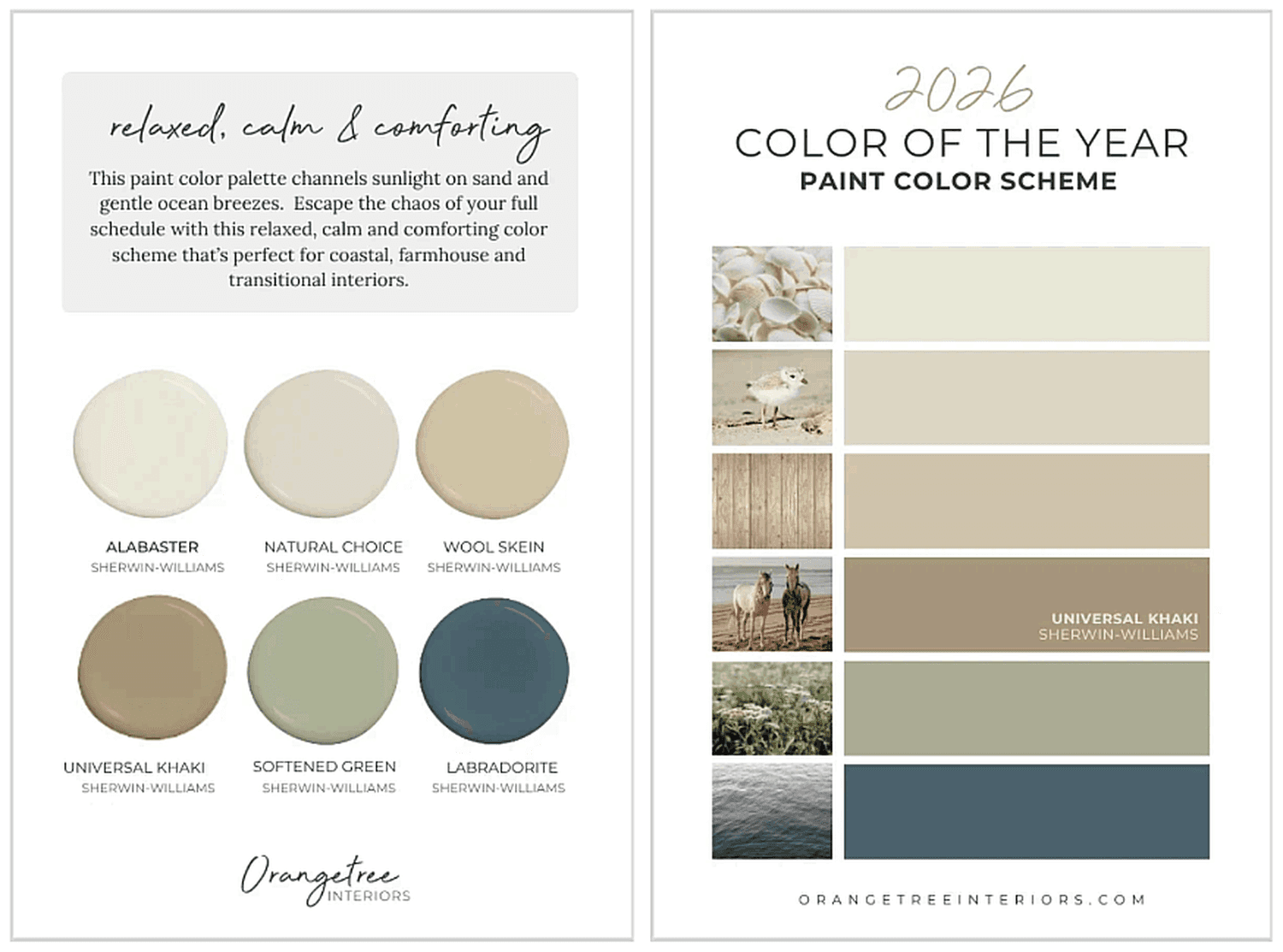
PAINT COLOR SCHEME #3 | Relaxed, Calm & Comforting
Inspired by flowery meadows, sandy walkways and ocean breezes, this combination of creamy
whites, soft beiges, as well as muted blue and green, helps unwind after a full day.
Best for: Coastal, Farmhouse or Transitional home interiors.
Feels like: An easy Sunday morning — peaceful, restorative and beautifully lived-in.
[Pin for later]
Get quick-ship, peel & stick samples here:
Alabaster | Natural Choice | Wool Skein | Universal Khaki | Softened Green | Labradorite
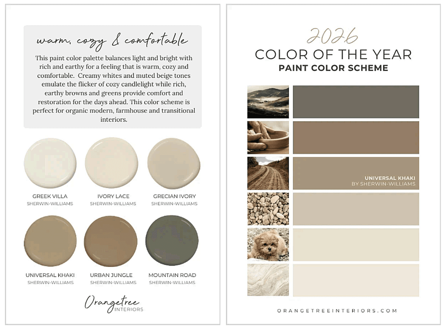
PAINT COLOR SCHEME #4 | Warm, Cozy & Comfortable
Balancing light and dark tones, this palette brings gentle warmth and subtle depth through
creamy whites and earthy greens for an aesthetic that feels warm, cozy and comfortable.
Best for: Organic Modern, Farmhouse and Transitional home interiors.
Feels like: Candlelight flickering at dusk - intimate, comforting and deeply restorative.
[Pin for later!]
Get quick-ship, peel & stick samples here:
Greek Villa | Ivory Lace | Grecian Ivory | Universal Khaki | Urban Jungle | Mountain Road
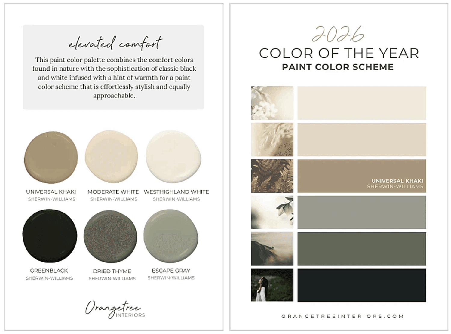
PAINT COLOR SCHEME #5 | Elevated Comfort
A sophisticated mix of black, white and nature-inspired hues, this color palette is classic and
modern with warm approachability.
Best for: Refined Farmhouse, Organic Modern or Transitional styles.
Feels like: A quiet conversation in a beautiful space — relaxed, balanced and refined.
[Pin for later!]
Get quick-ship, peel & stick samples here:
Universal Khaki | Moderate White | Westhighland White | Greenblack | Dried Thyme | Escape
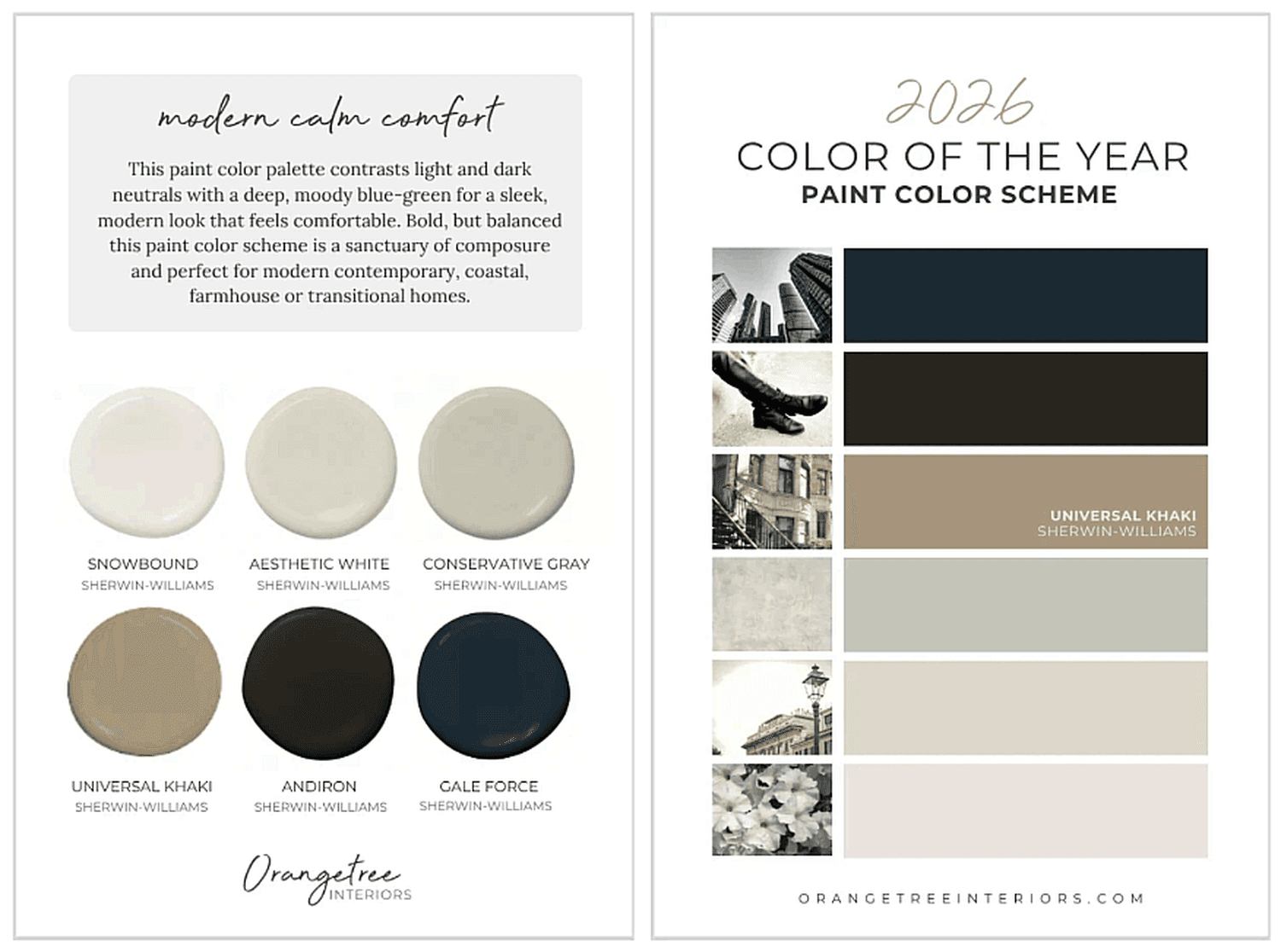
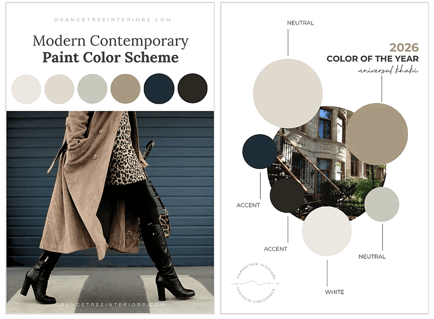
PAINT COLOR SCHEME #6 | Modern Calm Comfort
Bold contrast meets understated warmth in this paint color scheme. Deep blue-green contrasts
beautifully with grounded neutrals that make this palette perfect for those seeking a sanctuary
of composure and connection.
Best for: Modern Contemporary, Coastal, Farmhouse or Transitional home interiors.
Feels like: Confidence wrapped in calm — sleek, balanced and modern comfortability.
[Pin for later!]
Get quick-ship, peel & stick samples here:
Snowbound | Aesthetic White | Conservative Gray | Universal Khaki | Andiron | Gale Force
Designed to Save You Time and Bring You Peace
Each of these paint color schemes was created to help you connect emotionally to your home
without second-guessing color choices and spending hours testing swatches. The combinations
were thoughtfully curated to bring balance, beauty, comfort and calm to your home.......no matter
your style.
If you’re ready to dive deeper into color and learn how to create meaningful spaces throughout
your home, explore my DIY Interior Design Course for in-depth guidance, step-by-step design
strategies and ready-to-use color solutions made for real life.
Inside, you’ll discover how to create cohesive color schemes, design well-balanced rooms and confidently decorate your home—the same way I do for my clients. It’s everything you need to design a home that feels personal, connected and uniquely you - without wasting time, money or energy on guessing what works.
Start creating your dream home today. Take the course.

[Pin for Later!]
Let's talk about your project. No pressure, no obligation, just a friendly conversation about your vision and how we can help bring it to life.