In This Post
Looking for the best coastal paint colors for your home? This post shares my favorite soft whites, warm neutrals, watery blues, muted greens and sun-washed accent colors, along with tips for creating a cohesive coastal color palette and choosing the right shades for each room. You’ll also find specific Benjamin Moore and Sherwin-Williams paint recommendations, beach house color inspiration and links to my curated paint color scheme eBooks.
———————————————
This post includes affiliate links
5 minute read…..
———————————————
My favorite place to relax and decompress has always been the beach. The sound of the waves, the warmth of the sun and the sand between my toes have always made me feel at peace. I suppose it’s natural that I’m drawn to coastal paint colors then. Colors that remind me of soft sands, sunsets, and of course, water.

To me, the best coastal paint colors include warm whites, sandy greiges, watery blues, muted blue-greens and a few sun-washed accent colors. My favorites include Benjamin Moore Chantilly Lace and White Dove, Sherwin-Williams Drift of Mist and Topsail, plus deeper coastal shades like Van Deusen Blue and Grays Harbor. Together, these colors can create a relaxed coastal color palette that feels fresh and serene without looking overly themed.
If you want to bring easy, breezy coastal colors into your home or beach house, you’re going to want to read today’s post because it’s all about…..my favorite coastal paint colors (and why I love them).
But first, What Colors Are Considered Coastal Colors?
When you think of coastal colors, blue and white are probably the first shades that come to mind. While both are staples of coastal design, a true coastal color palette is much broader than that.
The best coastal colors are inspired by a beach landscape — the soft whites of seashells, warm sand, weathered driftwood, ocean water, dune grasses and the hazy colors of the sky. Rather than using the brightest or purest version of a color, coastal interiors often lean toward shades that feel subdued, sun-washed and slightly weathered, much like how colors naturally appear along the shoreline.
Think about a piece of driftwood that has been faded by the sun and salt water, or the way a bright blue sky becomes softer and hazier near the horizon. Greens found in seagrass and coastal vegetation tend to be more earthy rather than vivid, while blues in the ocean can shift between gray, turquoise, green and navy depending on the amount of sunlight and time of day. These natural variations are part of what makes coastal color palettes feel so relaxed and soothing.
How to Create a Modern Coastal Color Palette
A modern coastal color palette is less about using obvious “beachy” colors and more about creating a relaxed, layered look inspired by nature. Start with a warm white, soft greige or sandy neutral as your foundation, then layer in watery blues, muted blue-greens or soft natural greens. Deeper shades like navy, charcoal-blue or earthy green can be used in smaller doses to add contrast and keep the palette from feeling washed out.
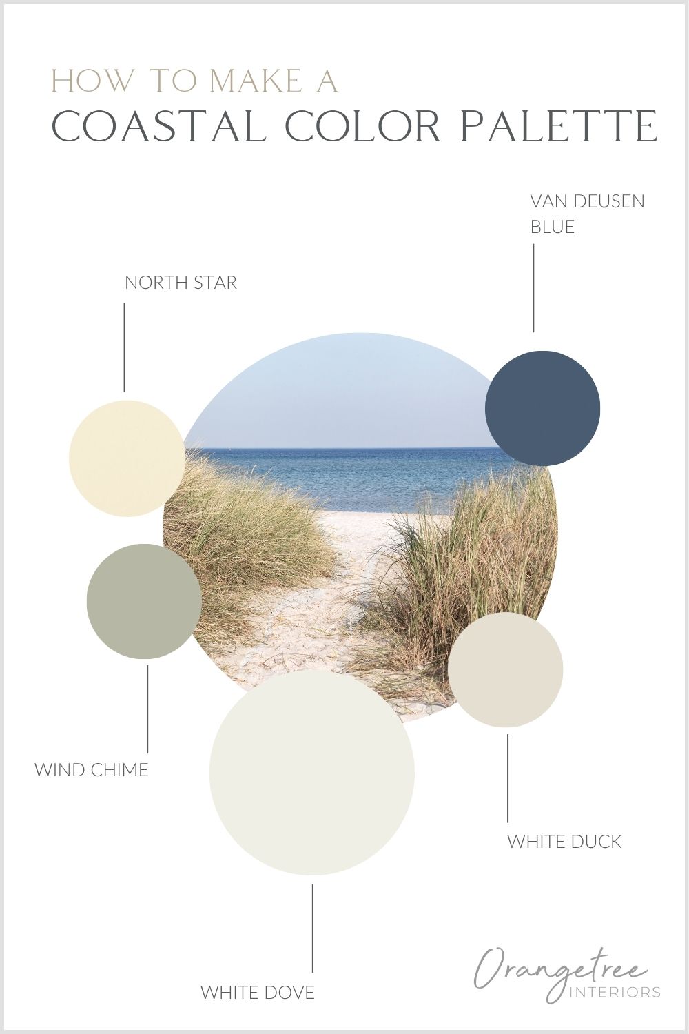
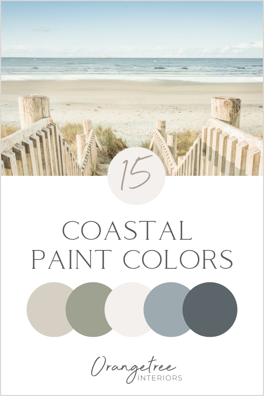
Coastal paint colors listed here.
The key is to keep the colors slightly softened rather than overly bright or saturated. Coastal interiors are inspired by things that have been naturally weathered by sun, sand, salt and water, so muted tones tend to feel more authentic and calming.
To keep the palette feeling modern, pair your paint colors with warm wood, woven textures, linen, stone and other natural materials. This creates warmth and dimension while keeping the overall look light, relaxed and refined.
BEST COASTAL WHITE PAINT COLORS
CHANTILLY LACE | Benjamin Moore
A bright, airy white that feels fresh. I love Chantilly Lace because it’s crisp and clean without feeling sterile. It’s the perfect bright counterbalance to soft grays, sandy beiges and watery blues. It’s my absolutely favorite white paint color – prefect for classic and modern coastal interiors.
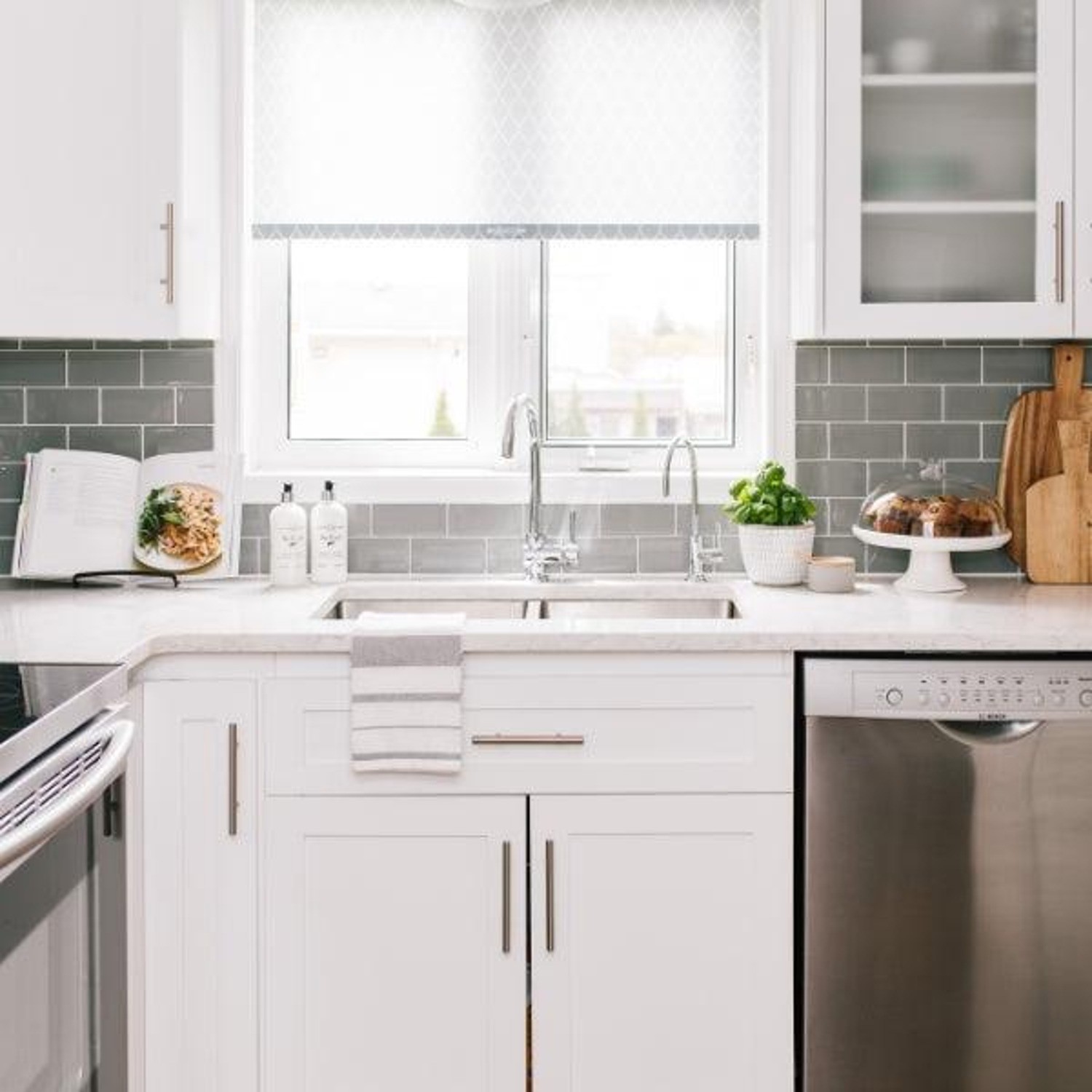
WHITE DOVE | Benjamin Moore
Soft and creamy, White Dove is a cozy coastal white. Its warmth flatters almost any room and it pairs beautifully with wood tones, stone, and natural fabrics.
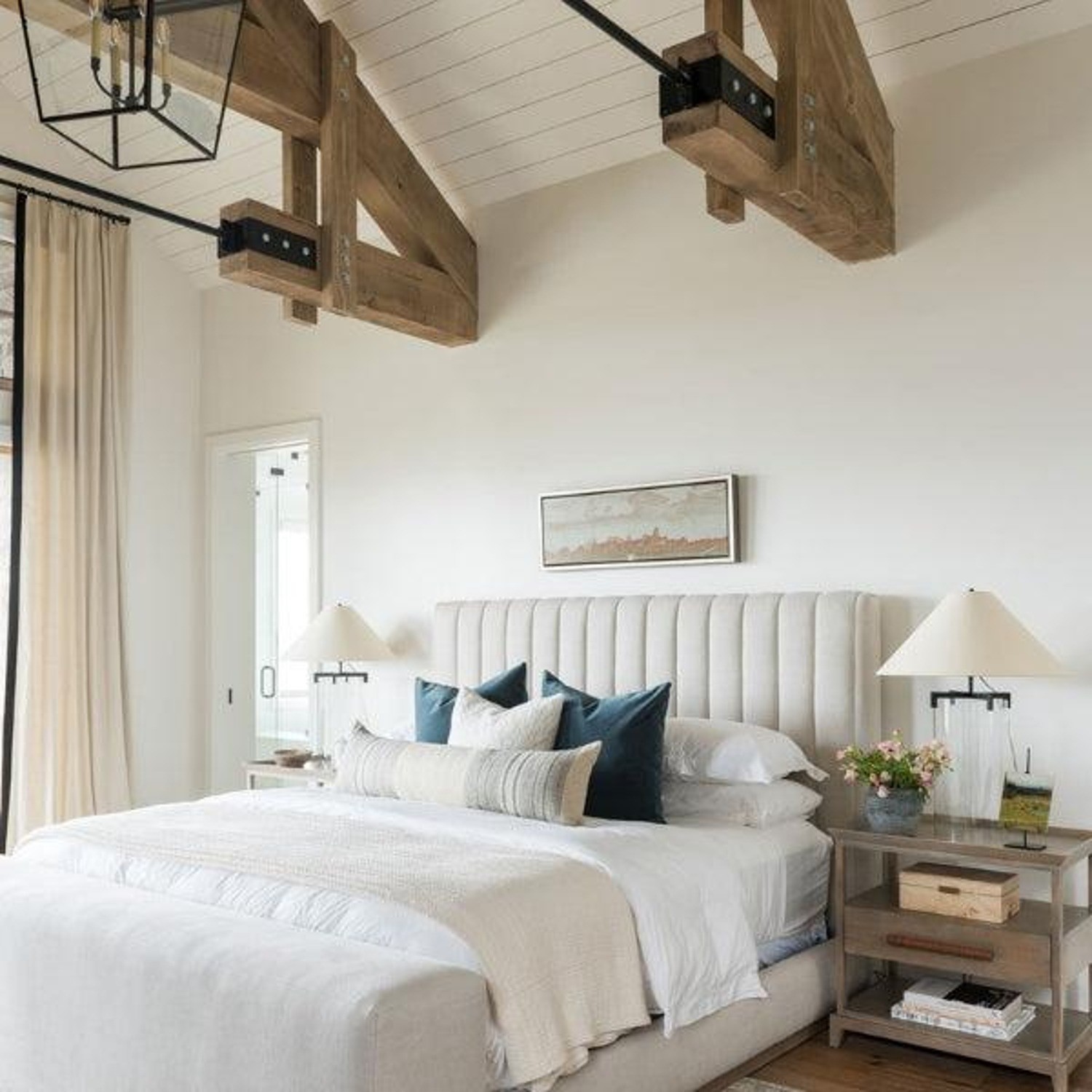
CLOUD COVER | Benjamin Moore
If you want a whisper of gray that doesn’t feel drab, Cloud Cover is your color. It has a quiet elegance that works beautifully as a subtle, serene backdrop for the other coastal colors in your design.
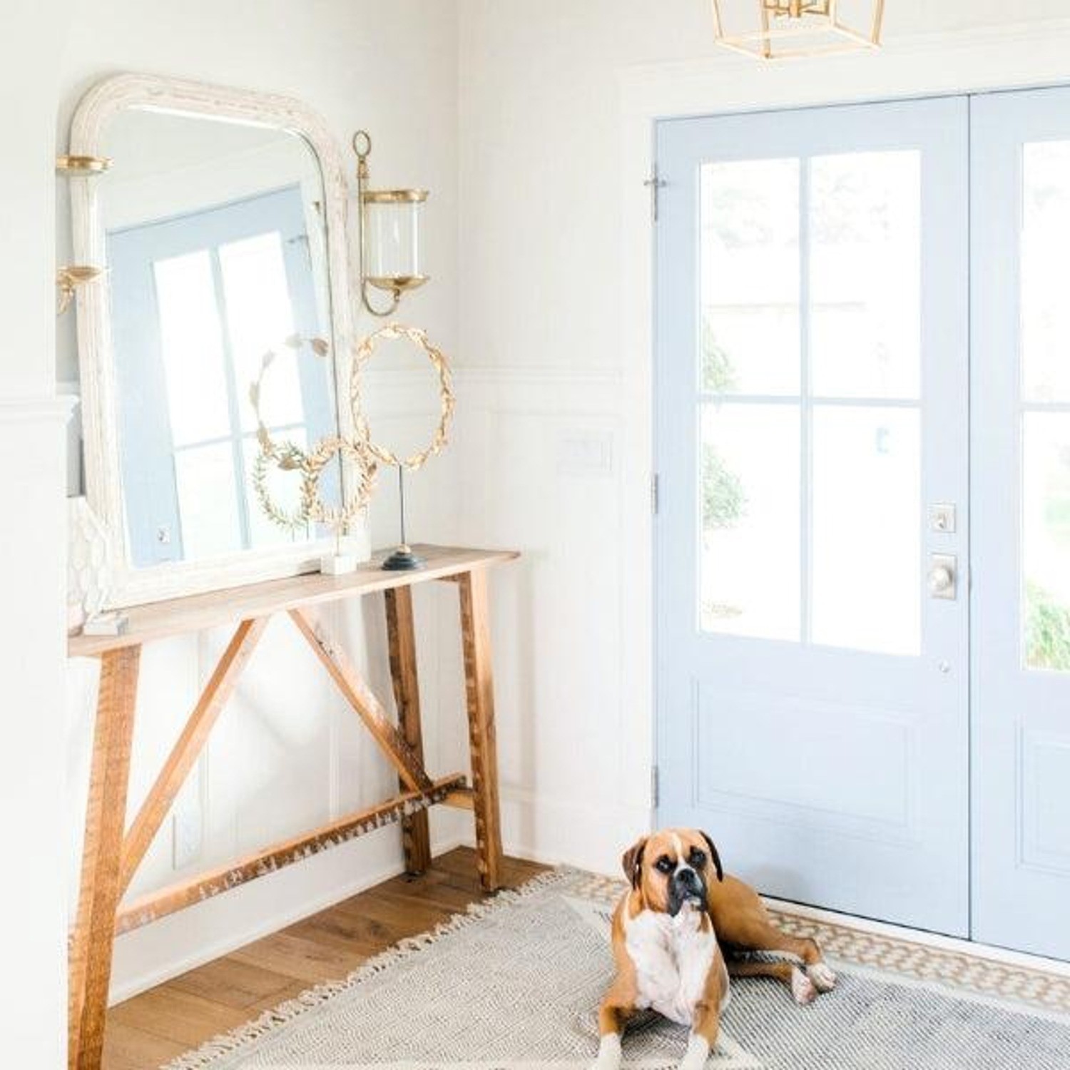
Source
WHITE DUCK | Sherwin-Williams
Is it white? Is it greige? White Duck is my go-to for a modern coastal aesthetic because it's so versatile. It's creamy without being yellow and gives off a "natural linen" vibe that works so well with both warm and cool colors. White Duck is as close to a no-fail paint color as you can get. It truly works with almost any other color - coastal or otherwise.
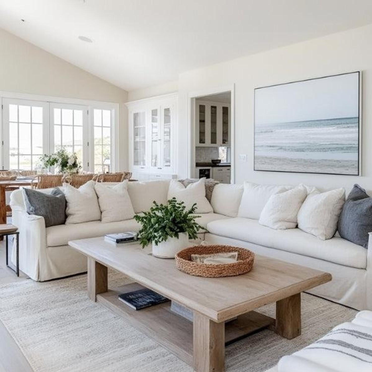
AI Assisted Design.
BEST COASTAL NEUTRAL & GREIGE PAINT COLORS
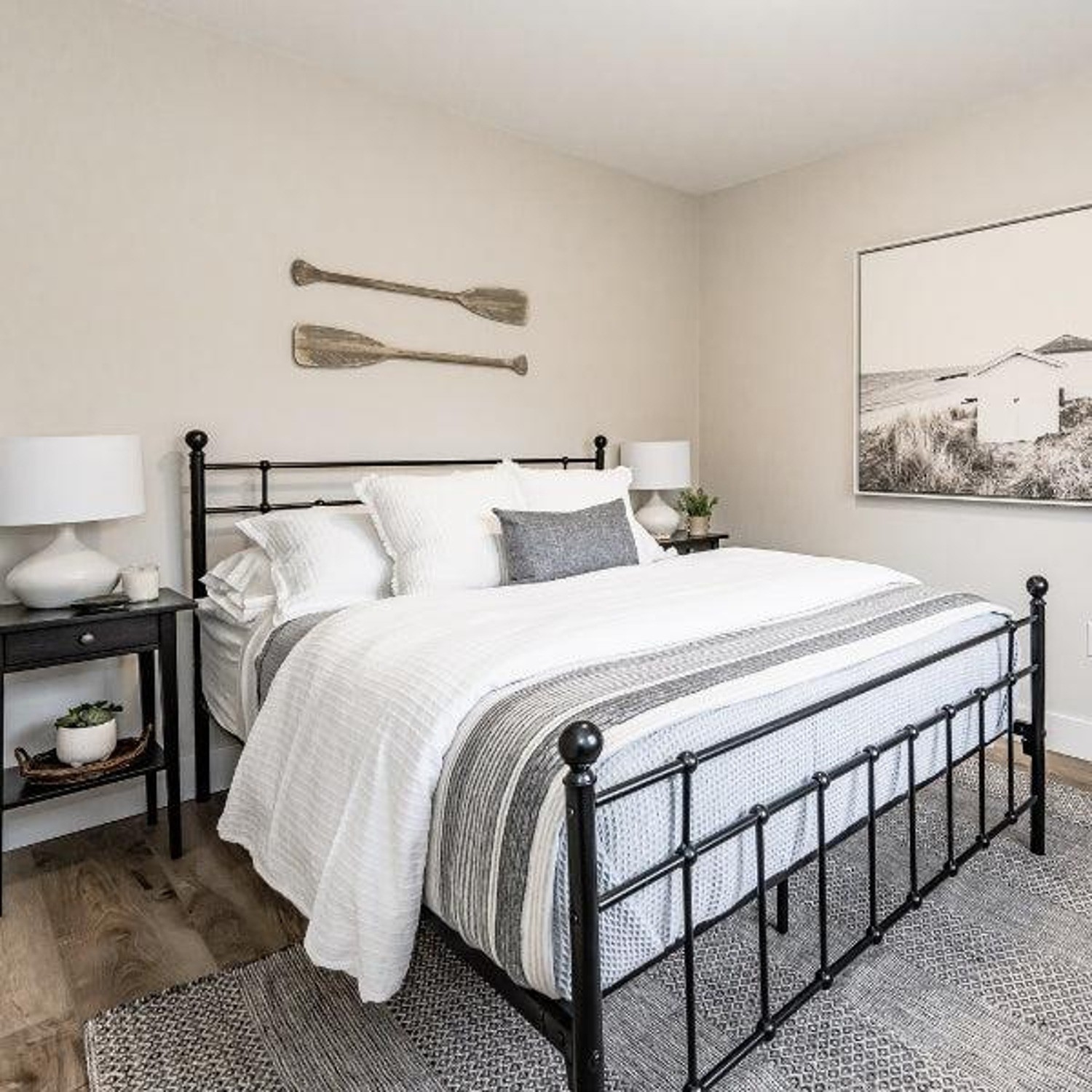
CLASSIC GRAY | Benjamin Moore
The name says it all – Classic Gray is a timeless, barely-there greige that can be considered an off-white. One of favorite paint colors for home interiors, Classic Gray is versatile and perfect for a sophisticated coastal aesthetic.

DRIFT OF MIST | Sherwin-Williams
Airy, calm, and endlessly versatile. Drift of Mist reads as a warm greige in some light and a soft off-white in others. It's ideal for creating a breezy, lived-in feel throughout an entire home.
BEST COASTAL BLUE PAINT COLORS
TOPSAIL | Sherwin-Williams
Topsail is probably the most predictable coastal paint color choice I’m going to make. It’s like a breath of fresh ocean air - light, subtle and has undertones reminiscent of turquoise waters. It’s ideal for bathrooms, beachy bedrooms and wherever else you're wanting true coastal vibes.
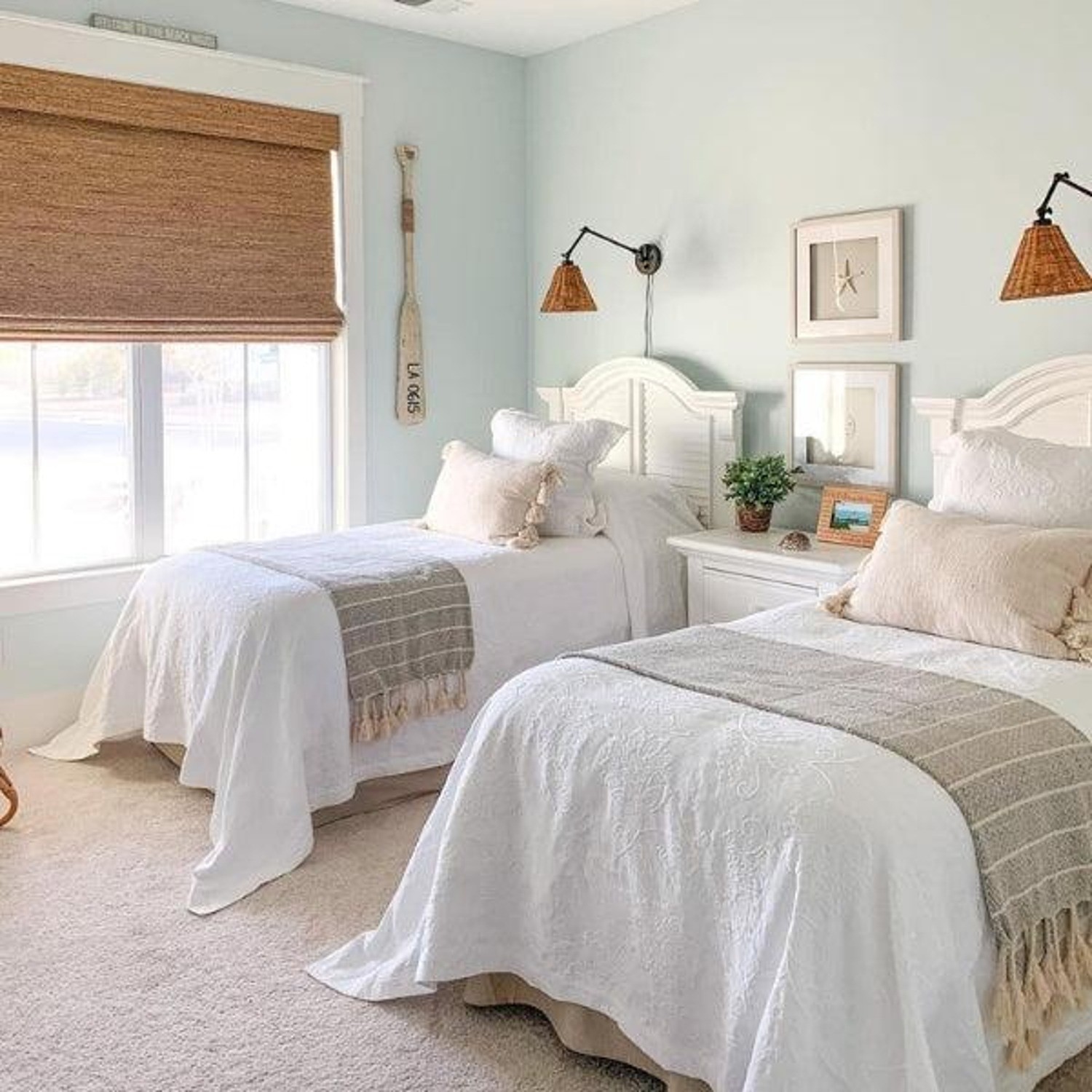
OYSTERSHELL | Benjamin Moore
A silvery blue-gray that shifts beautifully with the light. Oystershell (aka Wickham Gray) is elegant and cool, but never cold—it pairs beautifully with natural textures like rattan, white oak, and driftwood.
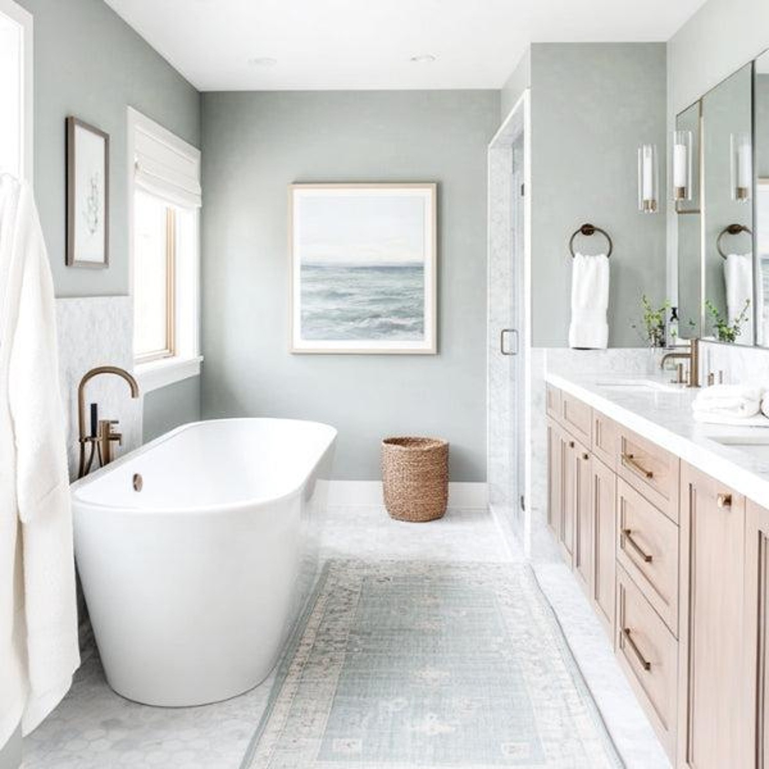
AI Assisted Design.
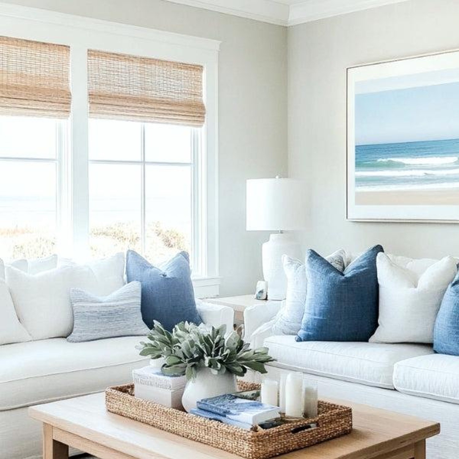
GRAY LAKE | Benjamin Moore
This one captures the essence of a foggy morning on the coast. A quiet, refined gray-blue, Gray Lake brings depth without overpowering.
AI Assisted Design.
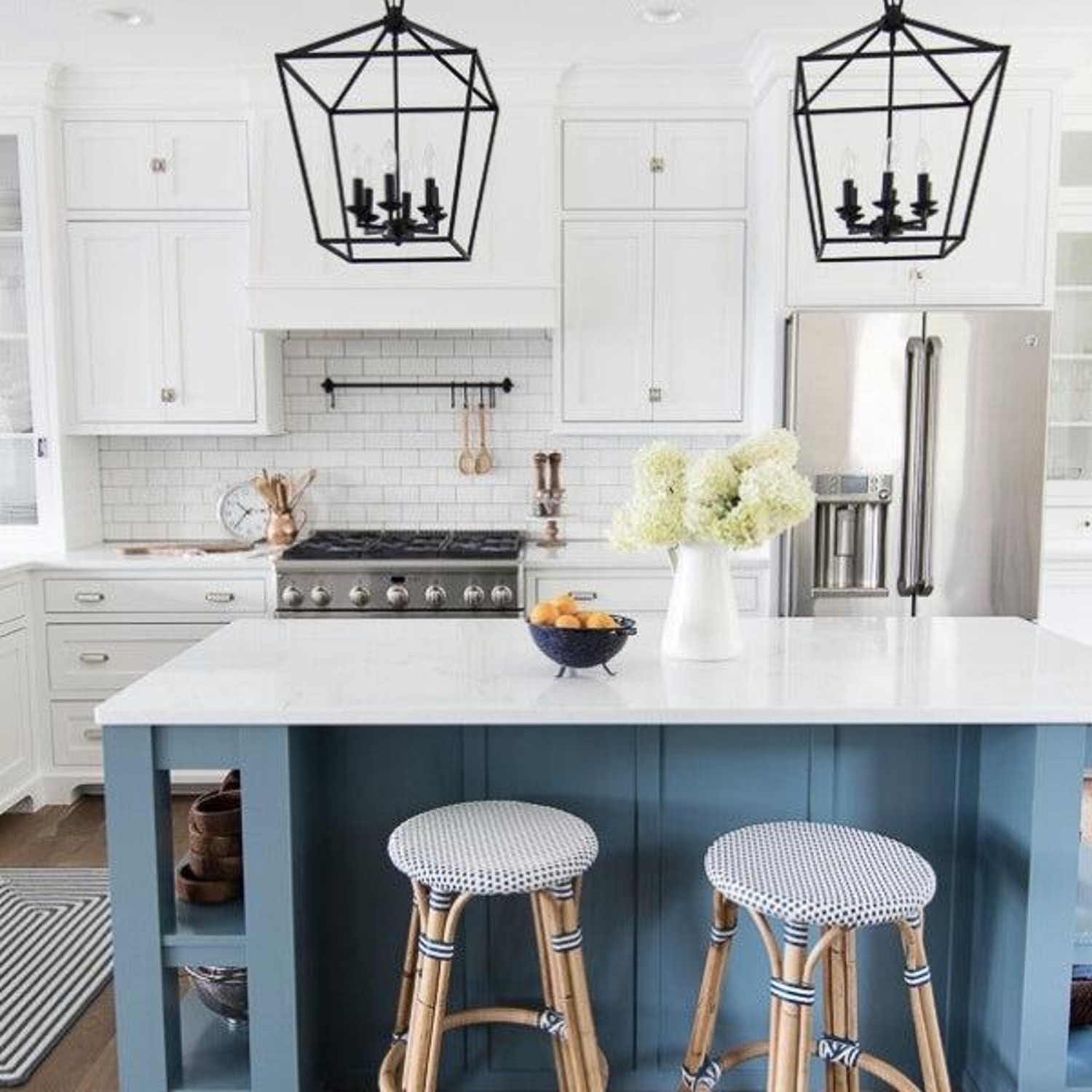
BLUSTERY SKY | Sherwin-Williams
For those who prefer more contrast in their color palette, Blustery Sky is the perfect coastal paint color to deliver. I use this when a space needs character without going too bold. My favorite spaces to use it are on in nooks, powder bathrooms and on cabinetry.
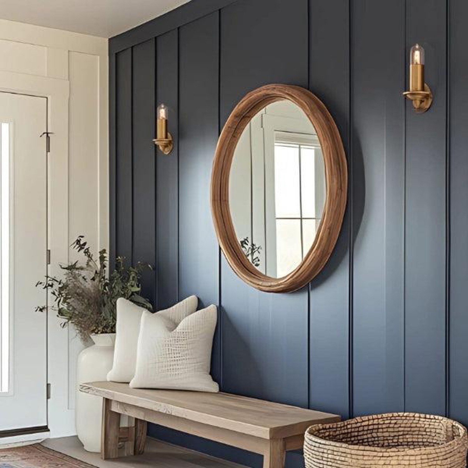
VAN DEUSEN BLUE | Benjamin Moore
Van Deusen Blue is classic, nautical and elevated. It’s saturated but refined - perfect for front doors, built-ins, or even a sophisticated office.
AI Assisted Design.
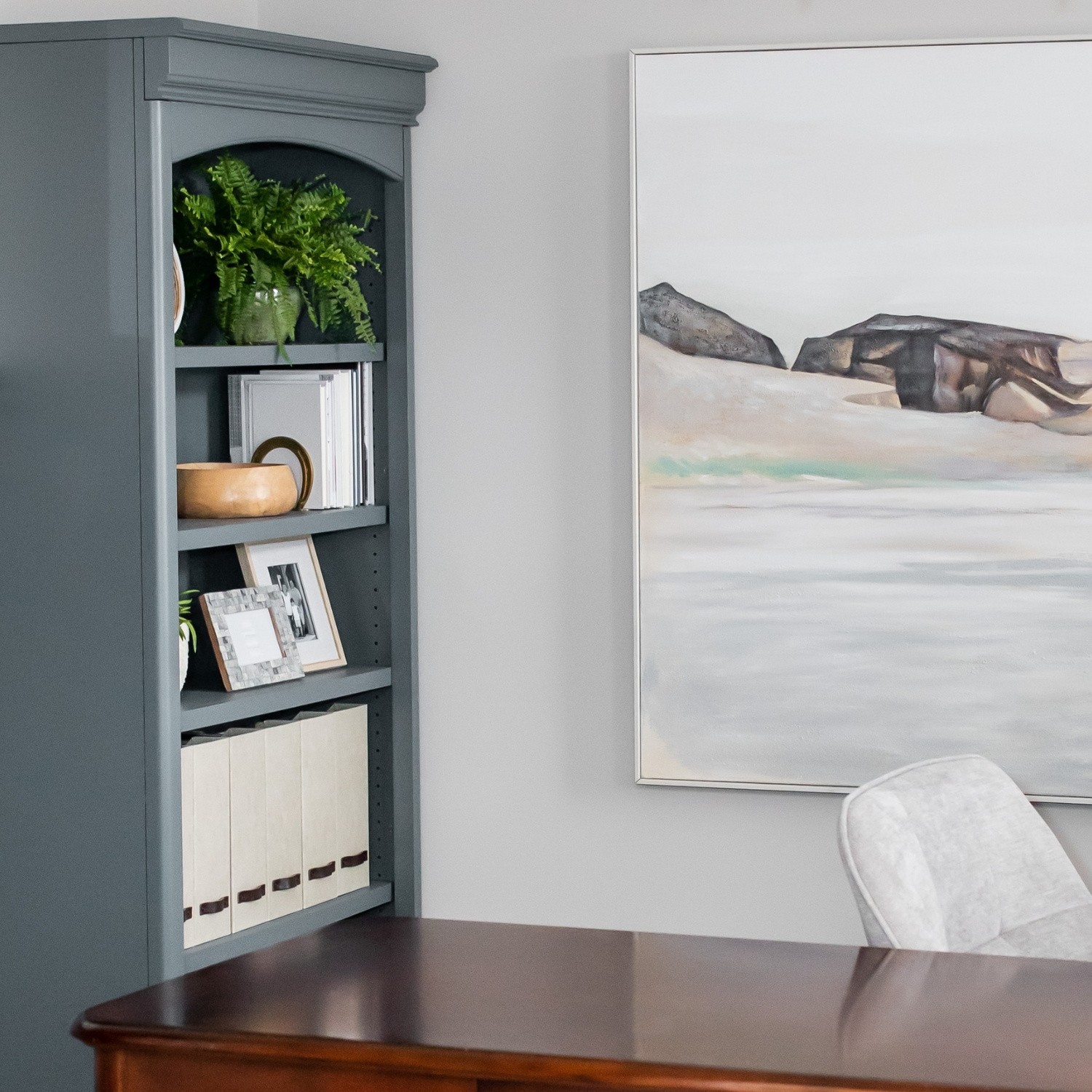
GRAYS HARBOR | Sherwin-Williams
A deep, moody blue-green-gray that adds richness and sophistication to your modern coastal color palette. I love using Grays Harbor on built-ins, cabinetry, or accent walls where a little drama still feels calm and grounded - especially when paired with white or natural wood tones.
BEST COASTAL GREEN & ACCENT PAINT COLORS
WIND CHIME | Benjamin Moore
A soft, muted green-gray that is subtle and peaceful. Wind Chime is a great paint color for bedroom or any other area of the home where you want a sense of calm.
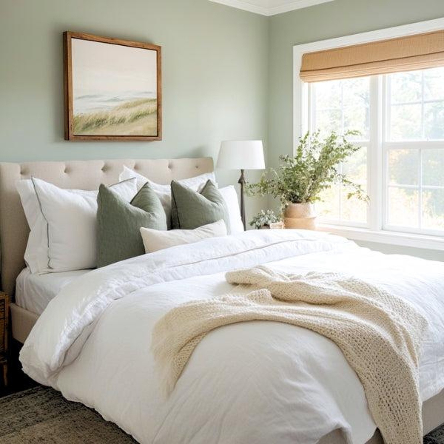
AI Assisted Design.
GORGEOUS WHITE | Sherwin-Williams
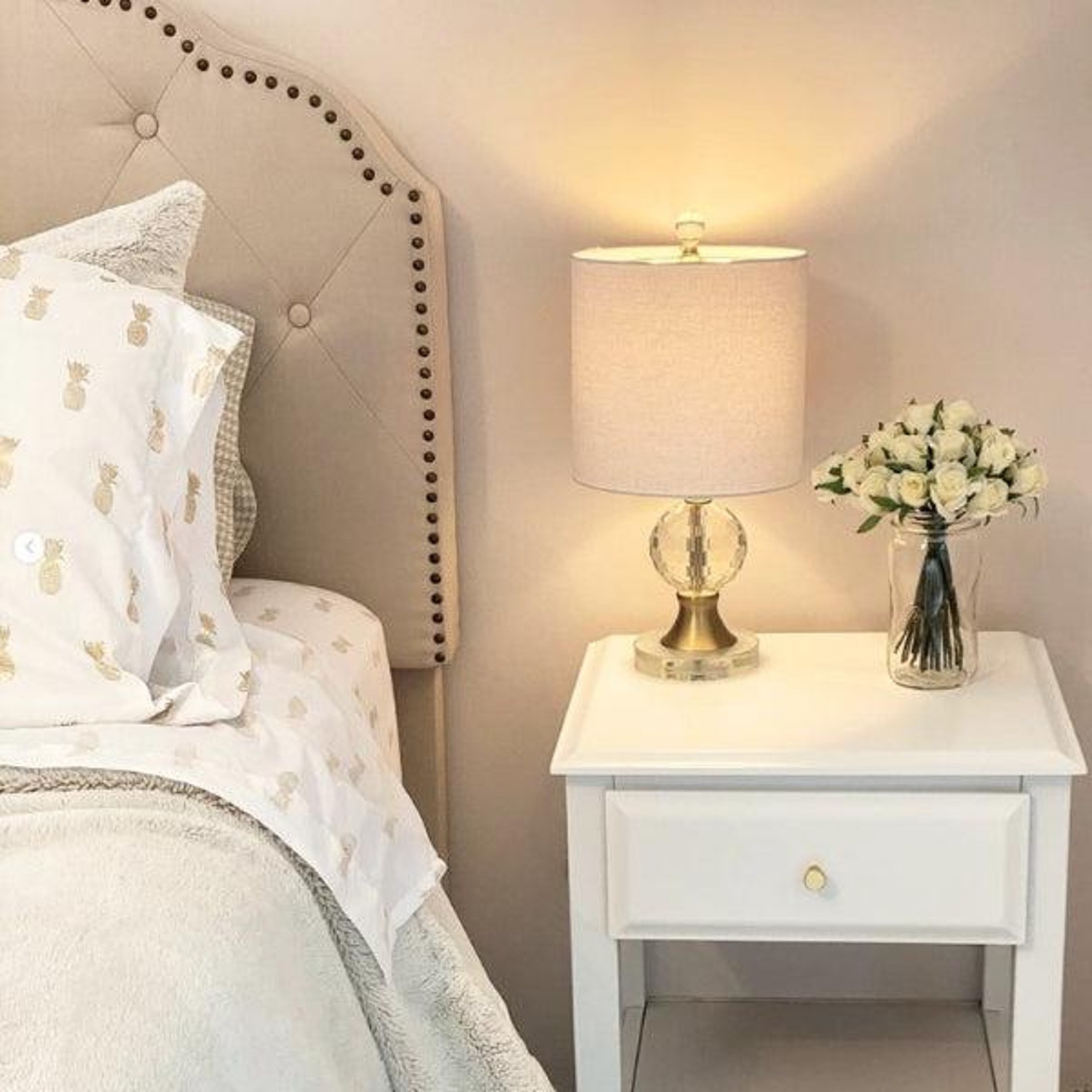
Gorgeous White isn’t actually white, but it is gorgeous. It’s the perfect subtle pink. Its blushy warmth reminds me of coastal sunsets, while its sunny personality feels as good as strawberry ice cream on a hot day. Gorgeous White is perfect for bedrooms, playrooms, and vacation property rentals.
NORTH STAR | Benjamin Moore
North Star is a muted, warm, glowy yellow that brings cheerfulness to any space. It’s perfect for adding a touch of sunshine without overwhelming a room. Truth be told, I rarely use yellow in my designs, but this one exudes happiness without being too intense. North Star would work beautifully in vacation rental properties, on a front door or anywhere you’d like to encourage conversation.
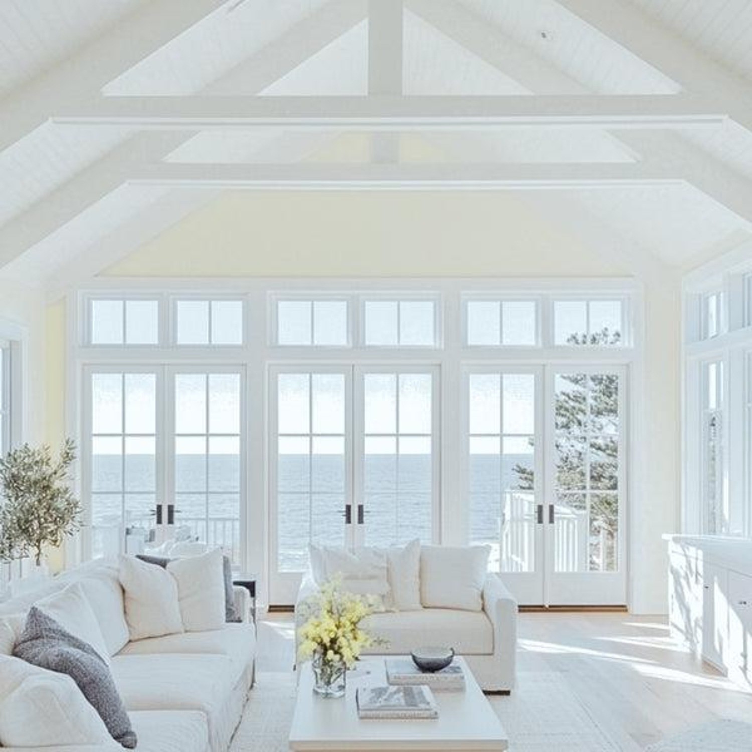
AI Assisted Design.
CHOOSING COASTAL PAINT COLORS BY ROOM
Choosing coastal colors by room is really about thinking about how you want each space to feel. While the same soft, nature-inspired palette can flow throughout your home, different rooms lend themselves to different shades. Living spaces often benefit from light, versatile neutrals, while bedrooms and bathrooms can handle a little more color to create a calm, restful mood. Kitchens are a great place to layer warm whites with deeper cabinetry colors, and entries or front doors give you an opportunity to introduce more contrast and personality. Here are some of my favorite coastal color directions for each room:
Living room: soft whites, greiges and gentle blue-greens
Bedroom: muted blues, greens and warm whites
Bathroom: watery blues and crisp-but-soft whites
Kitchen: warm whites, pale neutrals, deeper blue or green cabinetry
Entry/front door: Van Deusen Blue, Grays Harbor, Blustery Sky
Final Thoughts
Coastal paint colors aren’t just pretty - they change how a room feels. From breezy whites to soft blues and serene gray-greens, the colors above create a sense of calm and comfort that makes a home truly welcoming. I choose these colors again and again because they bring that relaxed, lived-in energy that coastal spaces are known for.
[Pin it for Later]
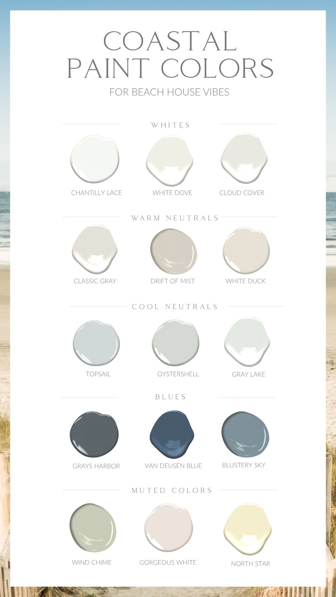
All coastal paint colors are linked here.
Pin this page to save these coastal colors for your next paint project. Or if you’re curious about how to pull a whole-home paint palette together (beyond these individual colors), I’ve got plenty more tips and DIY resources on the blog — check them out here or contact me. I’d love to help you create a home you love.
Want even more paint color inspiration? My 1st and 2nd Edition Paint Color Scheme eBooks each include 20 thoughtfully curated, cohesive color palettes designed to make choosing paint colors easier. Every scheme is created to help your home feel pulled together while supporting the mood you want to create — whether that’s calm, cozy, fresh, warm or refined.


Hope all these resources help you! Until next time, happy decorating!
Val xo
RELATED READING
East Coast Coastal vs. West Coast Coastal Interior Design
Our Living Room Reveal - A Cozy, Comfy Coastal Space Designed for Real Life
[Pin it for Later]
Let's talk about your project. No pressure, no obligation, just a friendly conversation about your vision and how we can help bring it to life.