Hey there design lovers! Today's blog is coming a little bit out of my comfort zone as I don't usually design with a lot of colour. However, recently I had someone ask me about split complementary colour schemes and how to use them in home interiors so I thought, I'd post about it.
So with that said, here's a little about What a Split Complementary Colour Scheme Is and How to Successfully Use it With Home Decor.

A split-complementary colour scheme is a refined and versatile approach to selecting colours for your home interior. It involves choosing a base colour and then pairing it with two colours that are adjacent to its complementary colour on the colour wheel. Incorporating all three creates a balanced yet dynamic palette that is both pleasing to the eye and easy to work with.
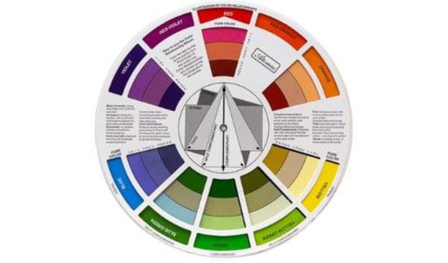
Indeed, a split-complementary scheme allows for more creativity and flexibility in decorating. You can maximize the use of this harmonious blend of contrast and similarity in your interior decor by following the tips below:
CHOOSE A BASE COLOUR
The first step in creating a split-complementary colour scheme is selecting your base colour. This could be your favourite colour or one that already exists in your home, such as a sofa or a piece of artwork. Once you've identified your base colour, use a colour wheel to find its direct complement. The two colours adjacent to this complement will be your secondary colours.
For example, if your base colour is blue, its complement is orange and the split-complementary colours are red-orange and yellow-orange. Applying this to the example above, you choose one of the colours as a base (for example yellow-orange for all of the chairs) and then you can accessorize your space with blue and red-orange throw pillows or other accents.
BALANCE WARMTH & COOLNESS IN THE LIVING ROOM
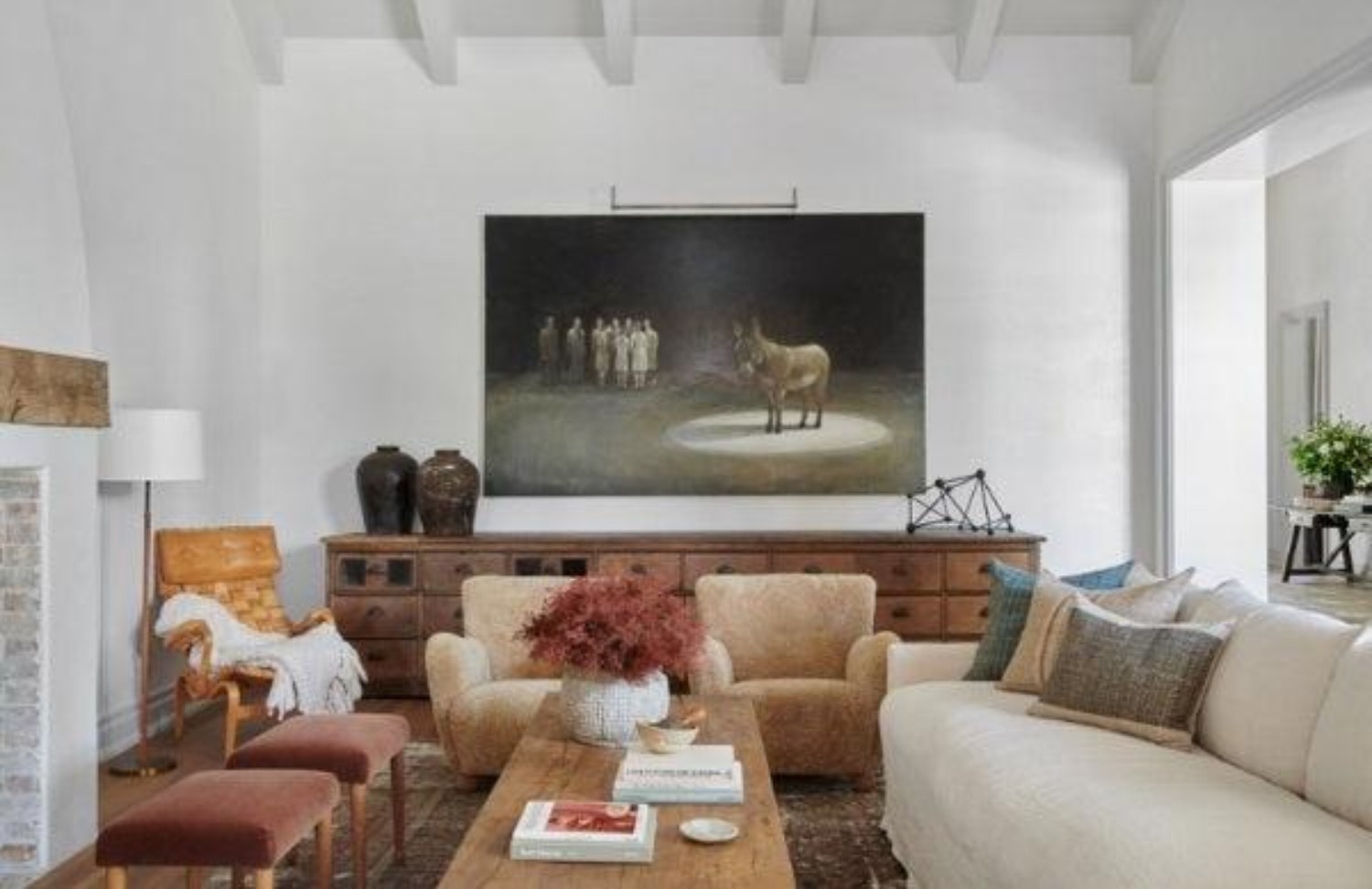
The use of a split-complementary colour scheme in the living room can create a space that is both soothing and stimulating. This is because the three primary elements in a split-complementary scheme will always be a combination of warm and cool colours.
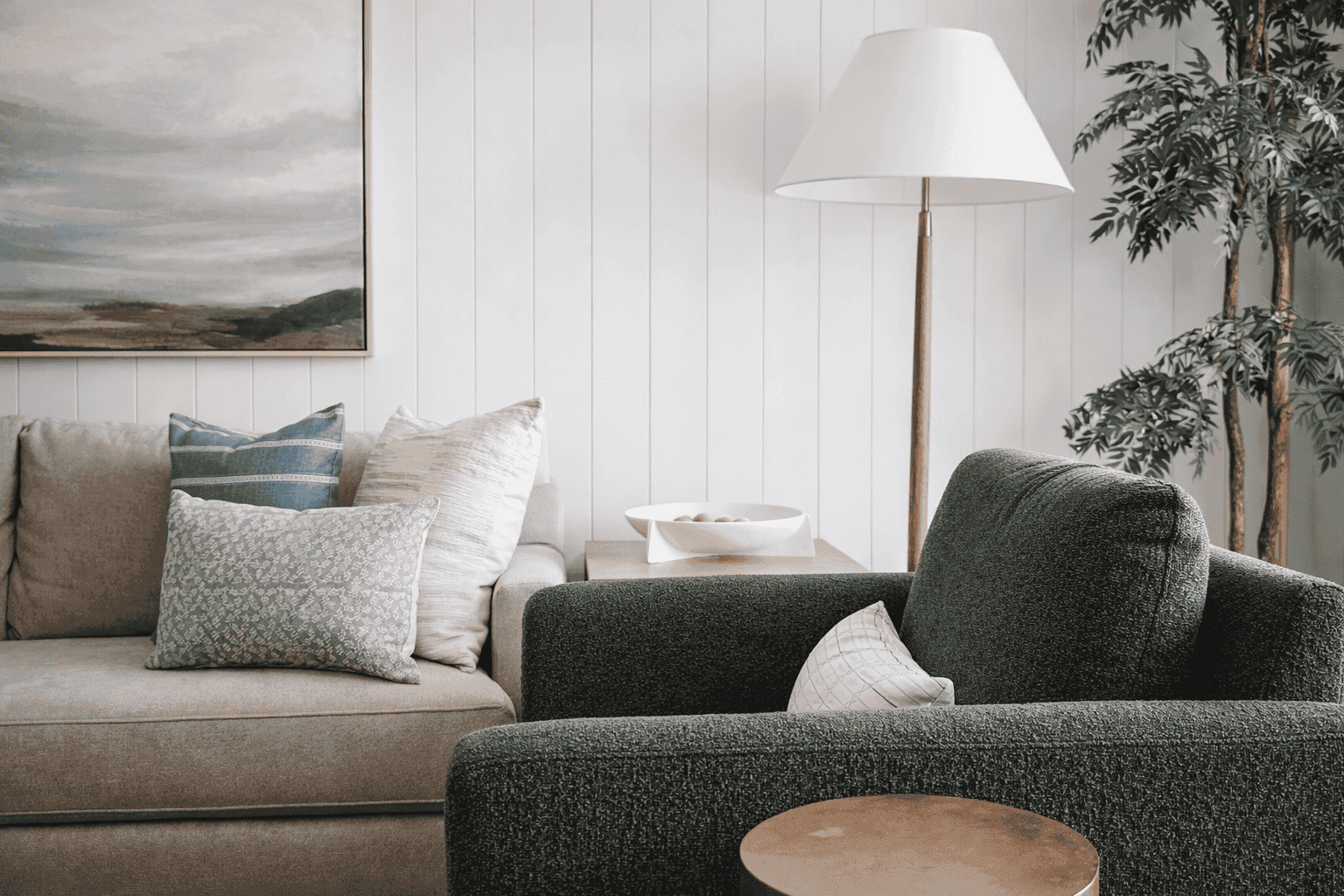
To perfectly balance this warmth and coolness, consider using the cooler colour as a base. As an example, you can use teal or blue for larger pieces such as the sofa or a gallery wall where you can hang your favourite contemporary art pieces and posters. You can then introduce coral through pillows, ottomans, rugs or the art pieces themselves, while yellow-gold might appear in smaller accents like vases, sculptural objects, floor lamps or picture frames. This combination keeps the room feeling balanced by offsetting the coolness of teal with the warmth of coral and yellow.
ADD VITALITY TO THE KITCHEN
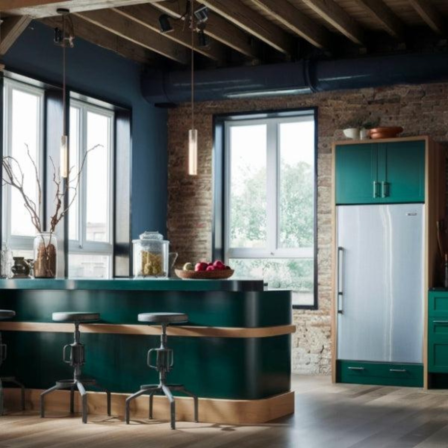
Kitchens are often the heart of the home and a split-complementary scheme can infuse this space with energy. You can start with a vibrant base colour like green for cabinets, then use its split-complementary counterparts blue-green and red-orange through a feature wall (like this brick), duct-work or small appliances and cookware. You can also use red-orange or blue-green cushions on dining chairs, dishware, or other decorative items.
CREATE A SERENE RETREAT IN THE BEDROOM
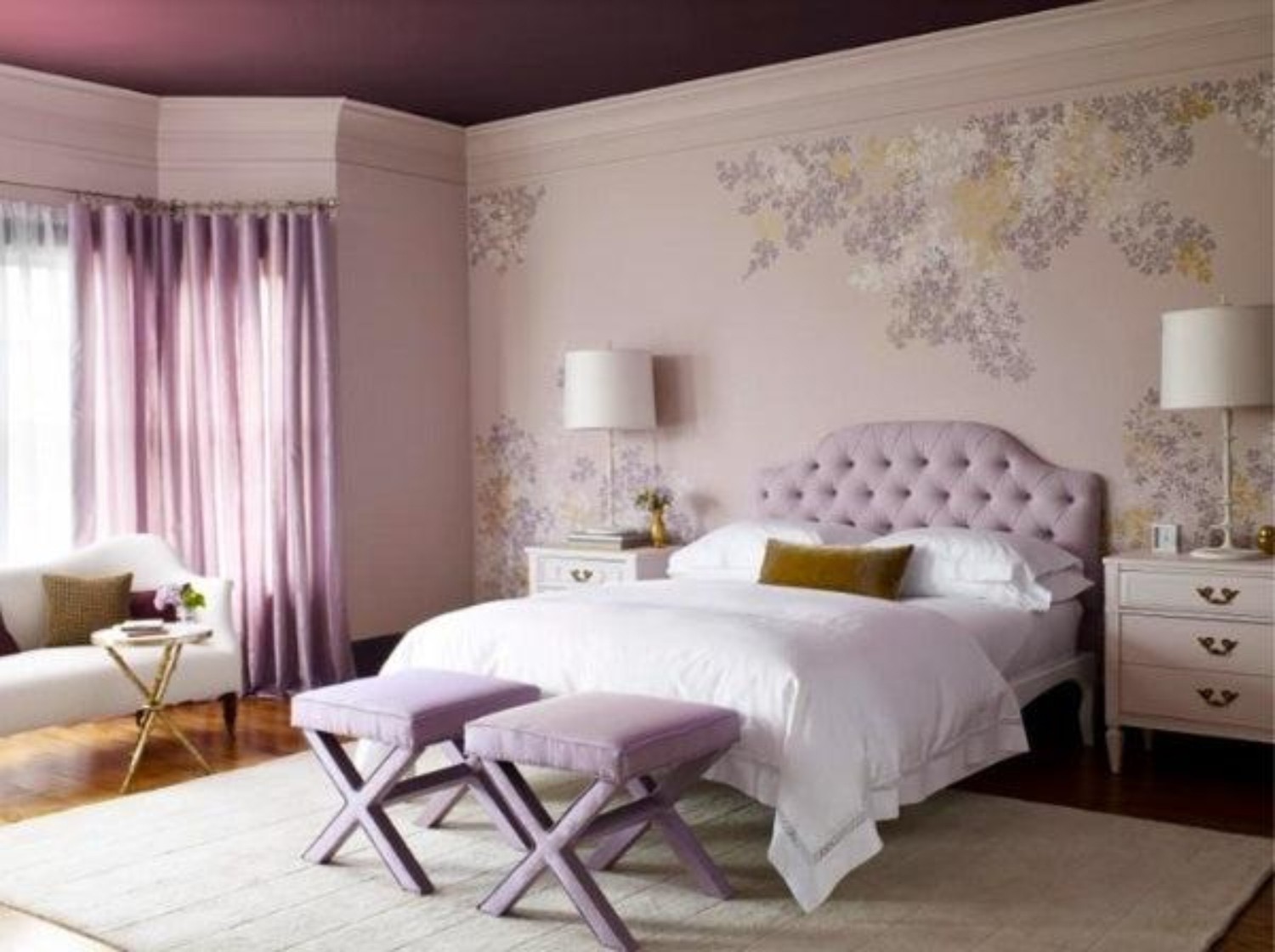
For a serene and restful bedroom, choose a calming base colour like lavender and its split-complementary colours yellow-green and red-violet. You can use lavender for the walls or bed linens to help set a peaceful tone. Then, accents of yellow-green might appear in a potted plant, a chair, wallpaper or decorative pillows. While red-violet can be introduced through artwork, a throw blanket or even the ceiling. This combination ensures the bedroom remains tranquil, while providing enough visual interest to prevent it from feeling monotonous.
GIVE THE BATHROOM A REFRESH
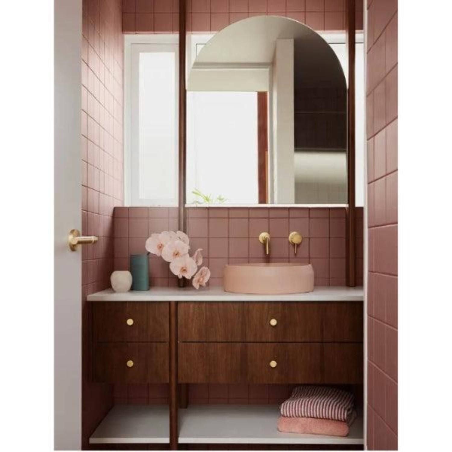
A bathroom can also benefit greatly from a split-complementary colour scheme. If you choose a base colour like mauve, its split-complementary colours are peach and aqua. Mauve tiles or wall paint can create a retro backdrop for the space. Then, you can incorporate peach and aqua accents in towels, bath mats or shower curtains, decorative accessories or artwork.
CREATE A SOPHISTICATED, INVITING DINING SPACE
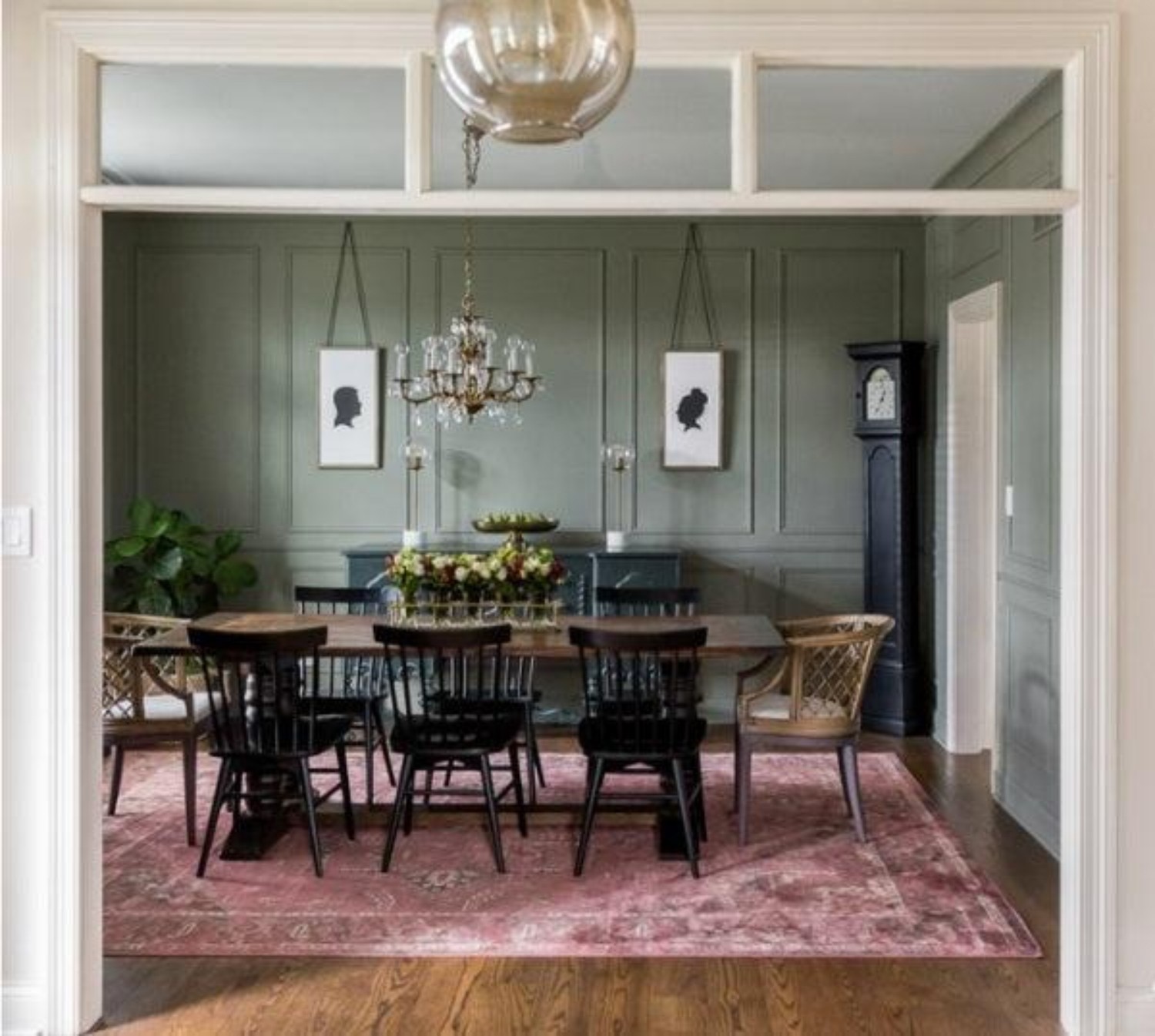
Using a split-complementary scheme in the dining room can make the space more elegant yet welcoming. For instance, if your base colour is burgundy, its split-complementary colours are blue-green and yellow-green. Burgundy can be used for an inspiration piece like a beautiful rug or artwork or more significant areas such as an accent wall, while blue-green and yellow-green can be showcased in furniture or other items like linens and centerpieces, plants and flowers or serveware.
BOOST PRODUCTIVITY IN YOUR HOME OFFICE
A home office should be designed for productivity and creativity, which means it can benefit from a stimulating yet balanced colour scheme.
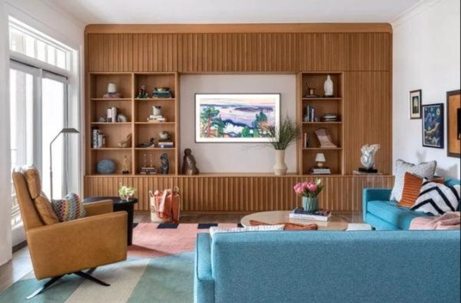
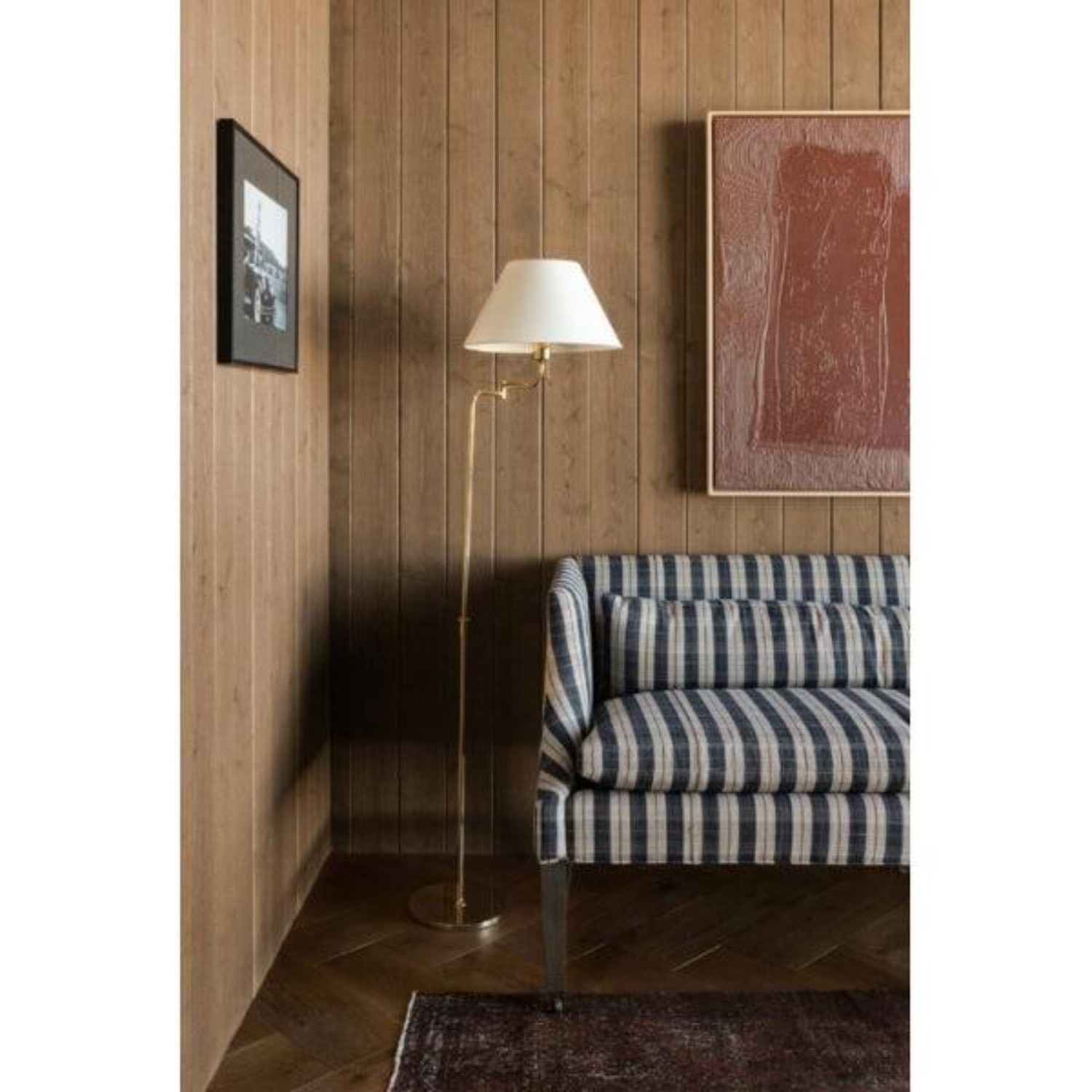
To begin, you can choose a base colour like yellow-orange like the undertone in this beautiful wood panelling. Then choose yellow-orange's split complementary colours, navy blue and red-orange for art work, furniture textiles, drapery and accent decor. This palette can keep the space lively and dynamic enough so you can focus on maximum productivity.
CREATE COHESION WITH ACCESSORIES
Accessories play a crucial role in tying your split-complementary colour scheme together. To maximize their impact, choose items that reflect your secondary colours, such as pillows, throws, rugs, and artwork. Metallic accents like gold, silver, or bronze can refine a space and help unify the overall aesthetic. Plants and natural elements like wood or stone can also complement your colour scheme and bring a sense of harmony to your space. Remember, the key is to balance the use of all three colours in a way that makes them complement each other in a harmonious way.
Applying a split-complementary colour scheme to your home decor can make experimenting with colours a fun, enjoyable experience. By using the method described above, you can confidently create a cohesive and visually appealing space that reflects your personal style.
Let's talk about your project. No pressure, no obligation, just a friendly conversation about your vision and how we can help bring it to life.

