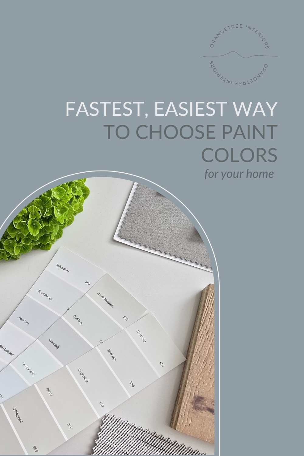
2 minute read…..
Choosing paint colors for your home shouldn’t be agonizing. Yet, for so many, it is.
You stand in front of a wall of paint chips. Everything looks either too gray, too yellow, too blue, too boring, too trendy, too something.
Hours later, you leave with a handful of samples and more confusion than when you walked in.
LET’S SIMPLIFY THIS.
If you want the fastest, least stressful way to choose a paint color that works beautifully in your home, here’s the no-fail method I use for choosing paint colors with my clients.
1 | Stop Looking at Paint First
This is where most people go wrong.
Paint isn’t the star of your room…..it’s the backdrop.
Before you look at a single paint swatch, look at what ISN’T changing in your space.
Your flooring
Your countertops
Your cabinetry
Your large furniture pieces
Your tile or stone
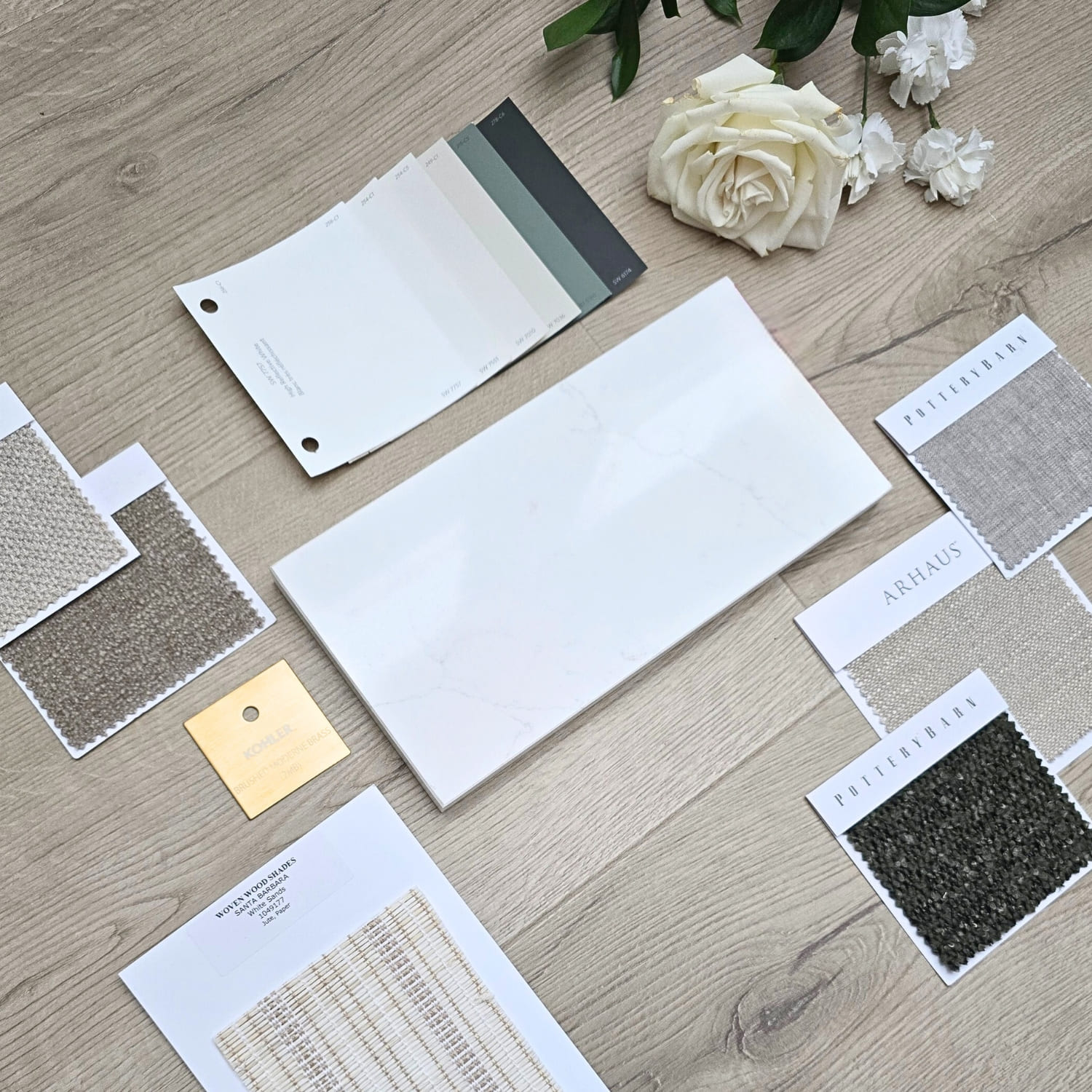
If these elements are staying, you need to consider their undertones. If you ignore them, your paint will fight the room instead of support it.
The easiest way to narrow your options is to identify whether your fixed finishes lean:
Warm
Cool
Or neutral
Once you know that, you can eliminate at least half of the paint colors available to you, instantly.
2 | Choose the Right Undertone for Your Paint Color
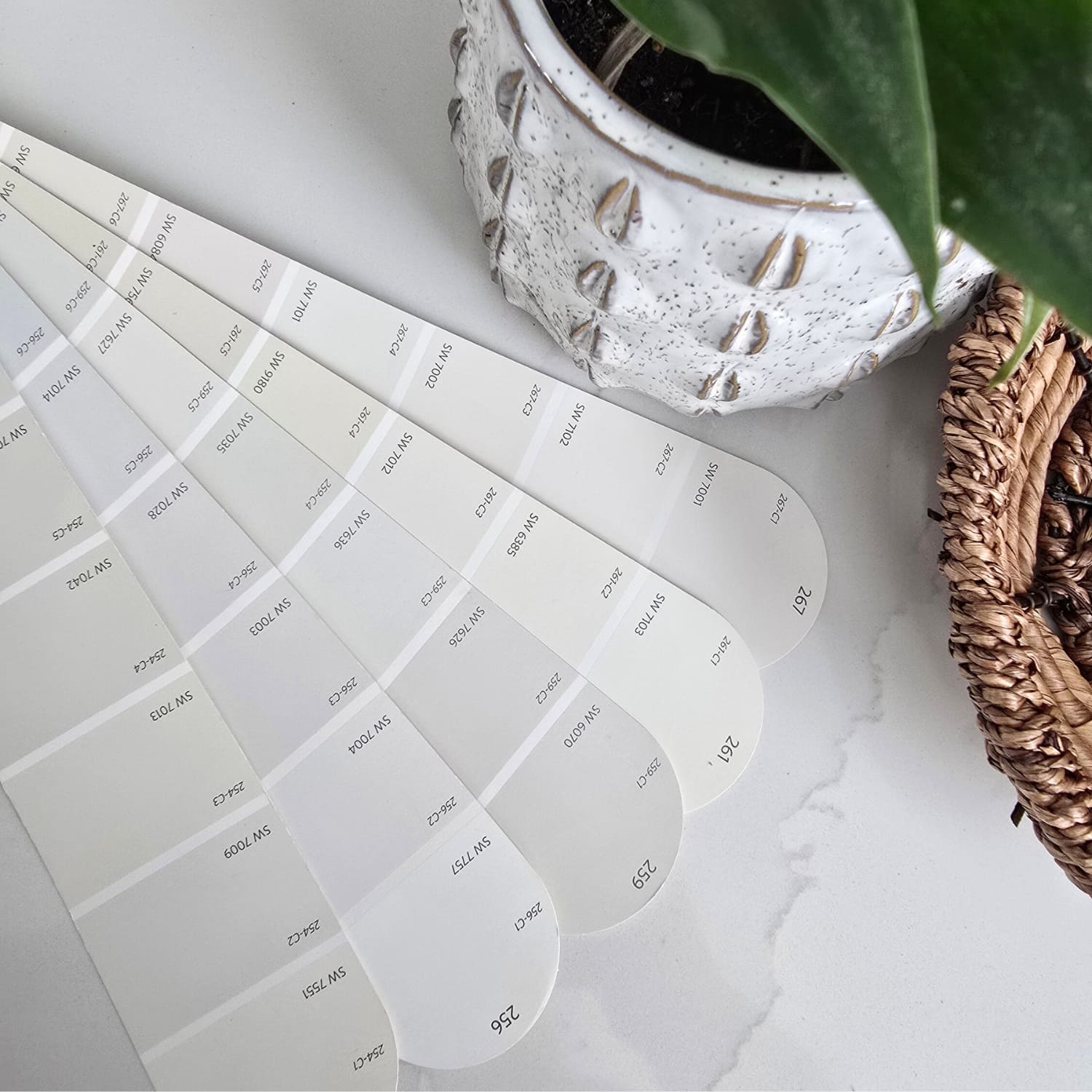
Most people say, “I want a greige paint color” or “I want a white paint color.”
That isn’t specific enough. What matters more than the color family is the undertone.
For example:
A greige with a green undertone feels calm and earthy.
A greige with a violet undertone can feel cooler and more modern.
A white with a yellow base feels creamy and warm.
A white with a blue base can feel crisp, but sometimes stark.
If your floors are warm oak, a cool blue-based white will look harsh.
If your tile has gray veining, a creamy yellow beige may look dirty.
This is part of the reason why some colors look beautiful online but once you get them home, they don’t quite work.
Undertone alignment + your home’s lighting is everything.
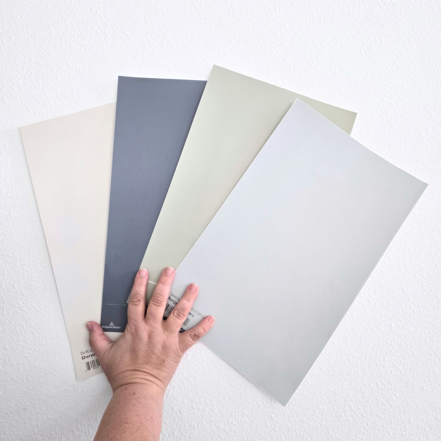
3 | When in Doubt, Use a Trusted Designer Neutral
If you want speed and confidence, skip the experimental shades. Choose a well-known, balanced neutral that designers return to again and again. You can see some of my favorite greiges here and favorite whites here, but some other reliable examples are:
A few reliable examples:
Sherwin Williams Drift of Mist
Sherwin Williams White Duck
Benjamin Moore Balboa Mist
Benjamin Moore Classic Gray
These colors are popular for a reason. They are balanced. They are adaptable. They work in a wide range of homes.
Are they exciting? Not, necessarily.
Are they safe, calming and beautiful? Yes.
And sometimes that’s exactly what a busy household needs.
4 | Sample the Right Way
Paint will always look lighter and brighter on a tiny swatch.
Here is the fast method:
Place them on different walls.
Look at them morning, afternoon and evening in natural AND artificial lighting.
Compare them directly against the fixed elements in your home.
Only sample a few paint colors at a time. It’ll become too overwhelming otherwise. Two or three paint colors is a good starting point.
5 | Remember What Paint Is Supposed to Do
Your paint is there to:
Support your furniture
Connect your spaces
Make your home feel cohesive
Create a desired feeling
It’s not there to prove you are creative.
It’s not there to follow a trend.
It’s not there to impress anyone.
The best paint color is the one that makes everything else in your home look better than it already does.
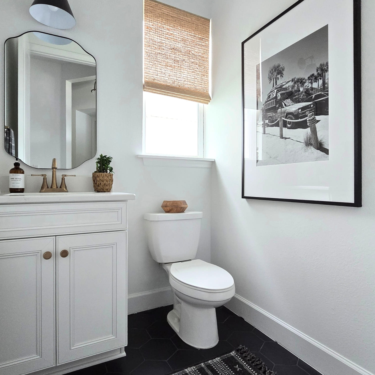
Before (Paint Color is Sherwin-Williams’ Extra White)
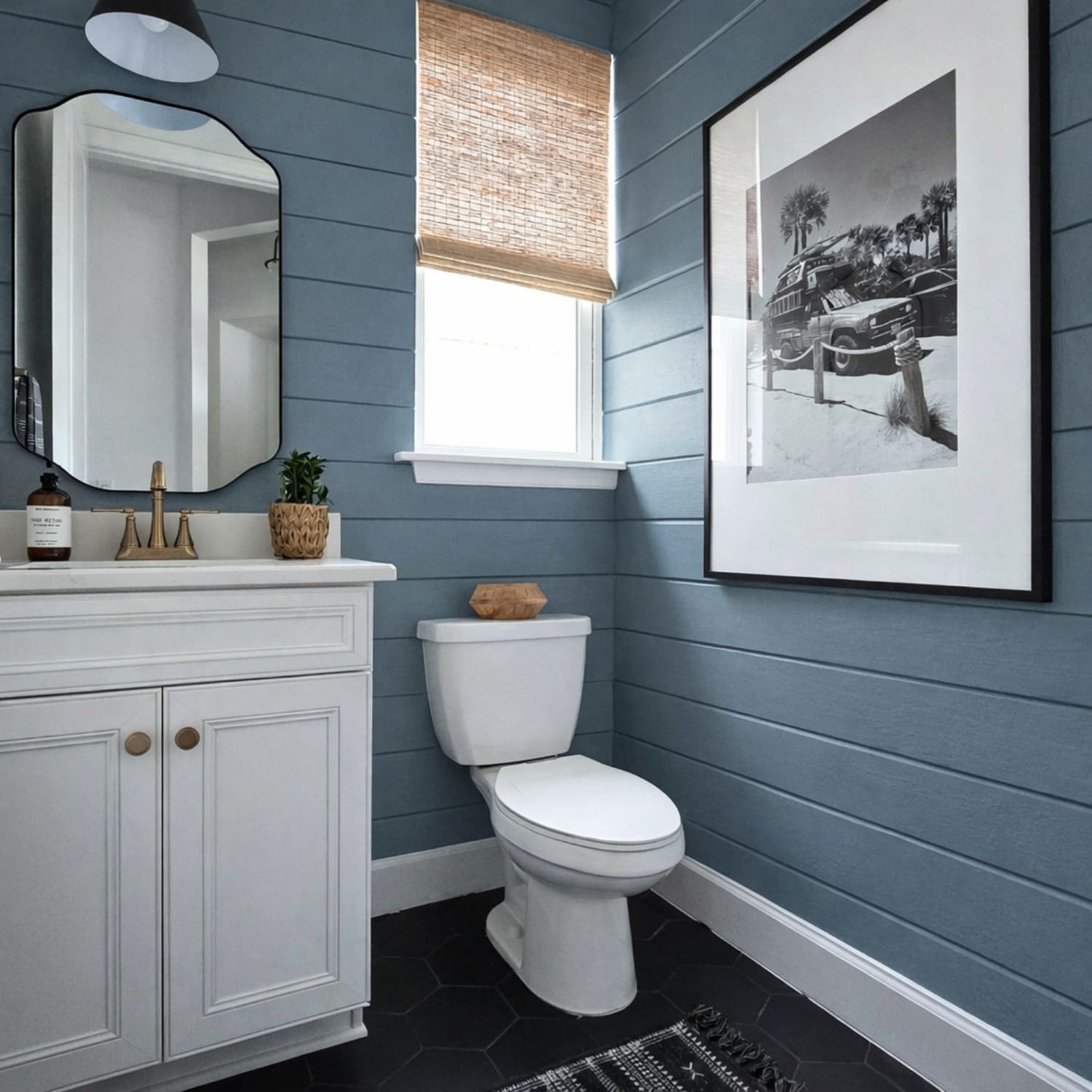
After (Paint Color is Sherwin-Williams’ Waterloo)
The Simplified Formula
Coordinate your undertones, choose a trusted neutral, sample it properly and avoid overthinking.
That’s it.
You don’t need 47 Pinterest boards.
You don’t need to analyze every blog post.
You don’t need to repaint three times.
You need alignment and restraint.
One Final Word for the Overthinker
If you have been staring at paint samples for weeks, here’s your sign to:
Choose the balanced option.
Choose the color that feels calm.
Choose the one that makes your home selections look intentional.
A beautiful home is built on thoughtful decisions, not dramatic ones.
When in doubt, simplicity almost always wins.
And if you are feeling stuck or simply don’t want to spend another weekend staring at paint samples, here’s an even faster option for you…….
I offer virtual paint consultations designed specifically for busy homeowners who value their time. I’lI help you choose the right colors for your home with confidence, so you can move forward without the trial and error.
Sometimes the most valuable investment is not the paint. It’s the time you get back.
If that sounds like relief, you can learn more about my virtual paint consult here. Or download a copy of my free Perfect Paint Colors Guide.
Hope this helps. Good luck!
Wishing you a home that feels as good as it looks,
Val xo
[Pin it]
RELATED READING
How to Choose Paint Colors for Your Whole House
Coziest Paint Colors for a Warm & Inviting Home
My Favorite Coastal Paint Colors (and Why I Love Them)
Let's talk about your project. No pressure, no obligation, just a friendly conversation about your vision and how we can help bring it to life.